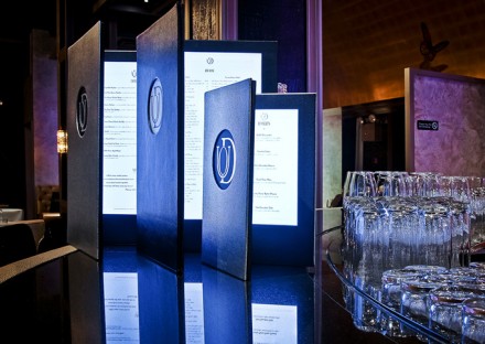
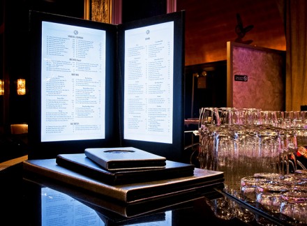
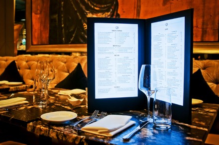
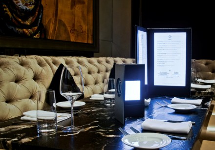
Often times it’s hard to design menus using color when they’ll be used in a dimly lit setting. Such is the case for most luxury, high end restaurant experiences. Duo was facing the same challenge. To overcome, they designed menus that are lighted much like an iPad so when opened there is plenty of illumination to allow for easy reading. The layout is simple and the menu covers are very well done as well.
I’m not a fan of DUO’s logo at all. I think it’s quite ghastly and hard to read. Hate to be a harsh critic, but a restaurant of such stature should have a brand identity on par.
I couldn’t find the designer of the menus and other restaurant branding elements. However, I was tipped off on this design by Armin at Art of the Menu.


