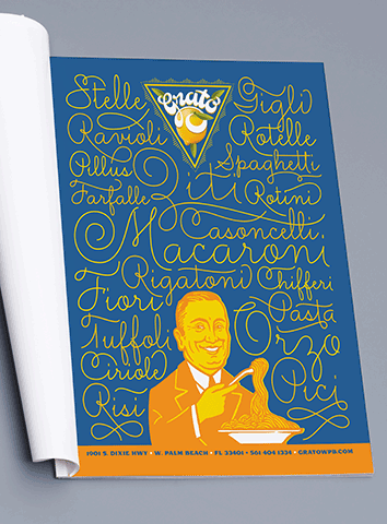
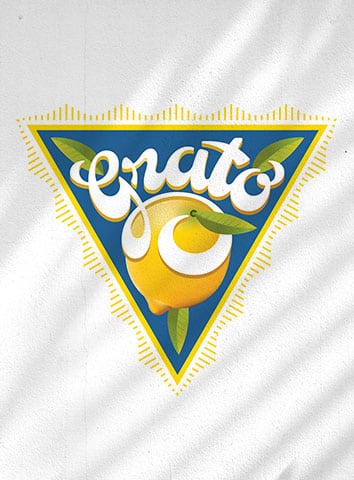
Grato’s look is inspired by vintage citrus food crates from Florida, fitting considering the restaurant is based in West Palm Beach. Grato means ‘grateful’ in Italian; mixing the typical Italian symbol of the Sicillian lemon pairs well with this vintage citrus crate application. The lemon is front and center at every turn; it shines warmly and brightly, whether its displayed prominently on the logo or packaging, or hinted at using its zesty shade of yellow.
Grato Branding & Print Design by De Vicq Design


