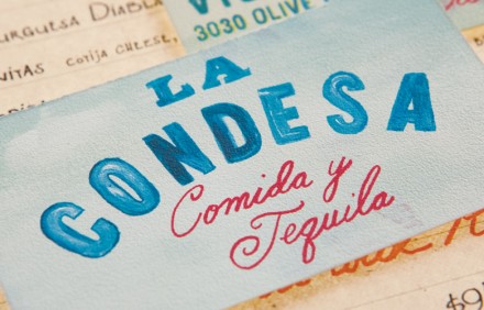
The team at Mucca designed the brand identity for La Condesa Comida Y Tequila. It’s marked by hand rendered typography giving it a common person’s feel, homemade, do-it-yourself. The aqua’s mixed with splashes of warm colors gives the overall brand a Mexican vibe you’d expect, in a way that’s semi-unexpected. What I especially like about this is the matchbook. Often times little items like this are overlooked and just produced for their utility. These are oppportunties to extend the brand and build awareness. Not to be taken litghtly.


