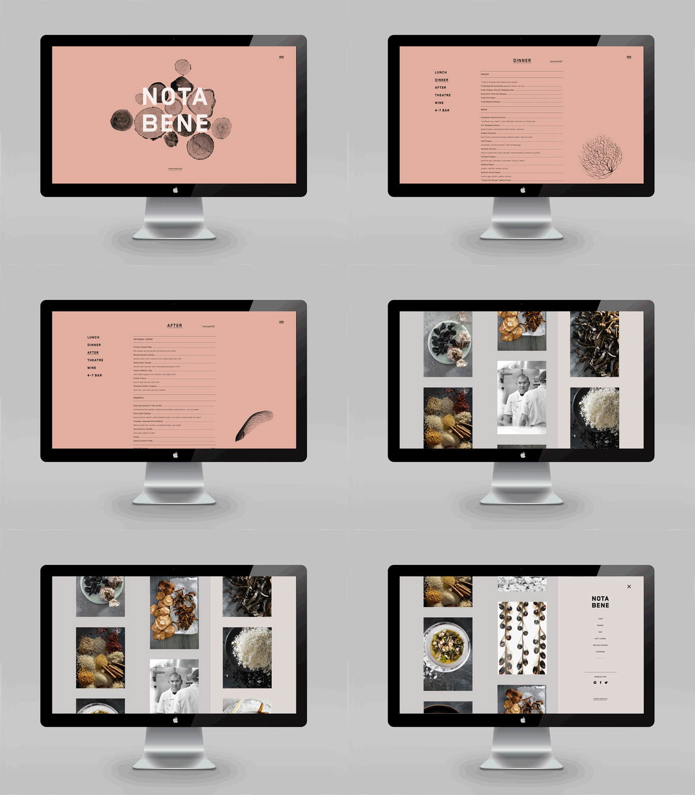
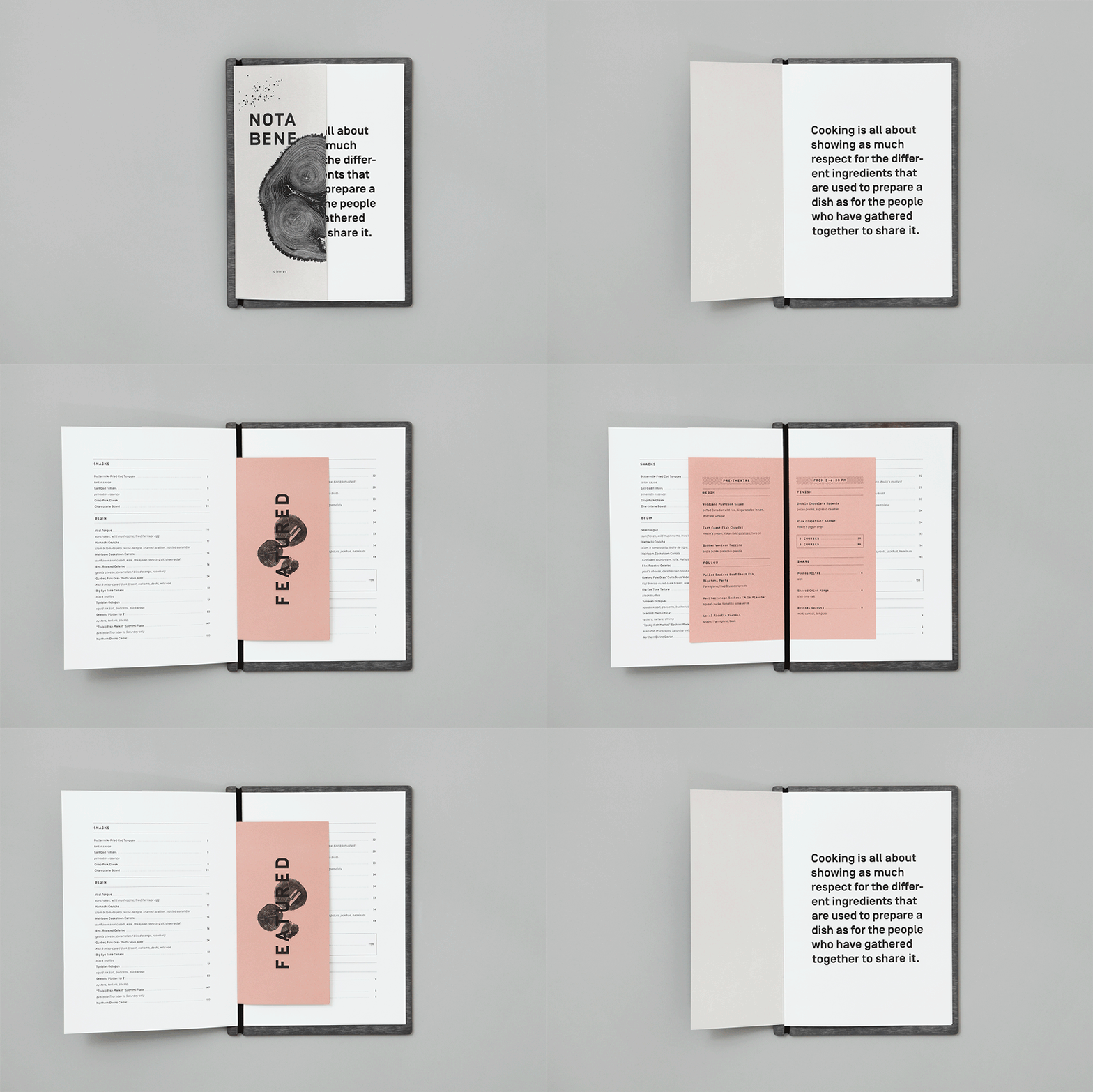
Nota Bene combines open, structured layouts with flat colors and highly-detailed photography to create a brand that looks upscale but not stuffy. Color plays a large role in accomplishing this; the warm tones of the palette adds friendliness to what could have been another cold, clinical minimalistic brand. Interesting layouts add to this air of levity; overlapping typography and imagery create dynamic, visual interest.
Nota Bene Branding & Art Direction by Blok Design.


