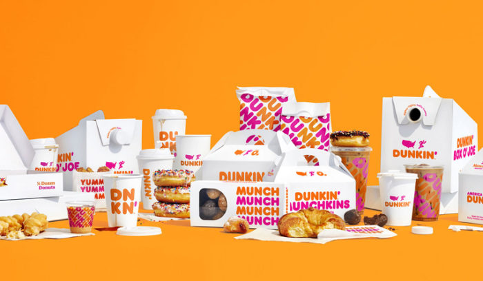
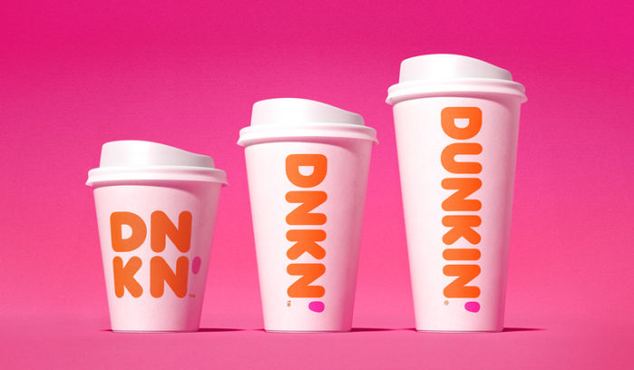
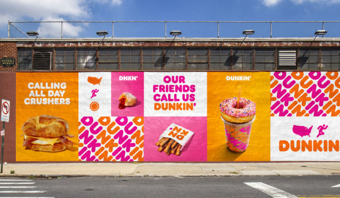
Those who’ve sat through a branding discussion with me know that I often call on Dunkin’ Donuts’ color scheme as a testament to the power colors wield. In short, you don’t need to actually look at signage or advertising for Dunkin’ Donuts to know it’s Dunkin’ Donuts. The colors do all the work. This morning QSR Magazine broke the story of Dunkin’s next step in brand evolution along with some photos of the newest expression.
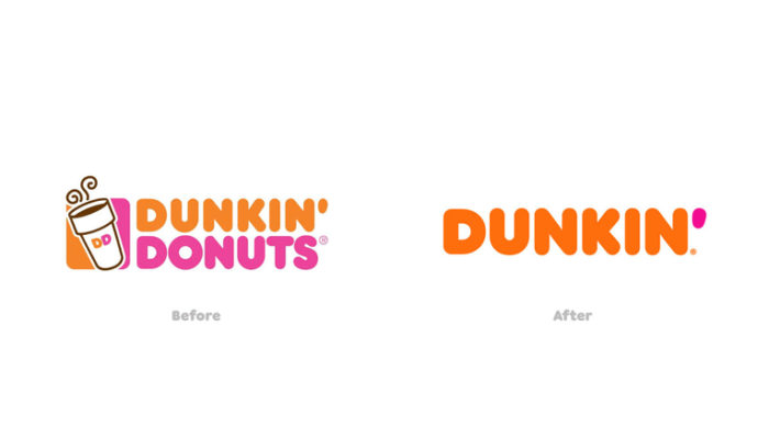
Dunkin, their new official brand name, has been on this path for some time now. In fact, they’ve already been using this truncated name here and there. This makes it official with an applied brand identity and standards. The good news is, they’re maintaining their iconic color palette and typography.
This brand evolution, specifically NOT a rebranding, is exemplary of responsible, smart, and powerful brand design. It maintains and bolsters the strengths where brand equity has been built and shakes off the superfluous thereby optimizing the identity, messaging, and voice. The brand identity design was developed in partnership with Jones Knowles Ritchie, BBDO New York, and Arc Worldwide.
For those unaware, Dunkin has been building its product mix for a long time. As of today, donuts account for only a percentage of what they make and sell. Keeping the word “donuts” continues a myopic description of who they really are as a brand. Although we’ll miss the lovely alliteration of “Dunkin Donuts”, this evolved expression is a welcomed step forward.
The QSR article states, “The new branding will be reflected in logos, packaging, advertising, online, and on new and remodeled units starting January 1. The signage flip will occur as stores are remodeled, and Dunkin’ doesn’t expect the branding change to incur any incremental costs beyond the way Dunkin’ ordinarily runs its business.” Now, onto some photos courtesy of Dunkin Donuts and QSR Magazine.
Special thanks to QSR for covering the story. Read their article for the detailed story.


