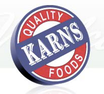
Karns is a Harrisburg area food store that has been known for its selection of choice cut meats for decades. Everyone knows Karns for its meat selection. Their brand is solid. Their brand communication, especially identity falls incredibly short. Frankly, it’s garbage.

Starting with the centerpiece of the brand identity, the logo, it doesn’t take a trained eye to notice some elements that don’t make sense.
1. The 3-D elements conflict to create an impossible effect. Take a look at the word KARNS 3-D rendering in comparison with the circles’. They blatantly conflict.
2. The typography and color palette selection is outdated and weak. Put simply, use a typeface that doesn’t come with the computer. Red, white and blue…cliche. It doesn’t stand out in the brandscape at all.
3. The graphical element’s 3-d rendering poorly reproduces in traditional media like embroidery, fax documents, and other medias that don’t play well with three dimensions.
I am going to just stop there. I could plummet into the execution of wayfinding elements, interactive experiences and the various other advertising and branding touch points, but this post to turn into The Iliad quickly.
The bottom line is this: It’s heartbreaking to see a brand so well built on its infrastructure and promise to fail so badly in its identity, marketing and advertising execution.
Wahhhhh, wahhhh, wahhhhhhhhhhhh.


