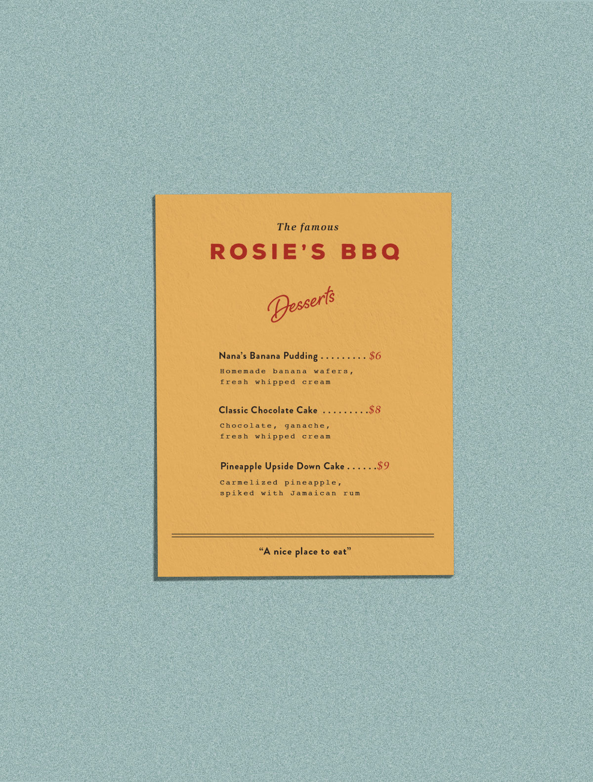
Most BBQ concepts are focused on fiery or masculine imagery, brimming with rustic textures and and dark charcoal-inspired colors. Rosie’s in Savannah is a bit different. It takes a distinctly softer and feminine approach, using a soft pink that references the color of smoked meats, script typography, and a hand-painted floral texture. It’s a look that feels welcomingly vintage but still fresh. Menus are organized cleanly, using boxes and a strong typography hierarchy to make them easy to navigate.
Rosie’s BBQ Restaurant Branding by Kendra Lebo.


