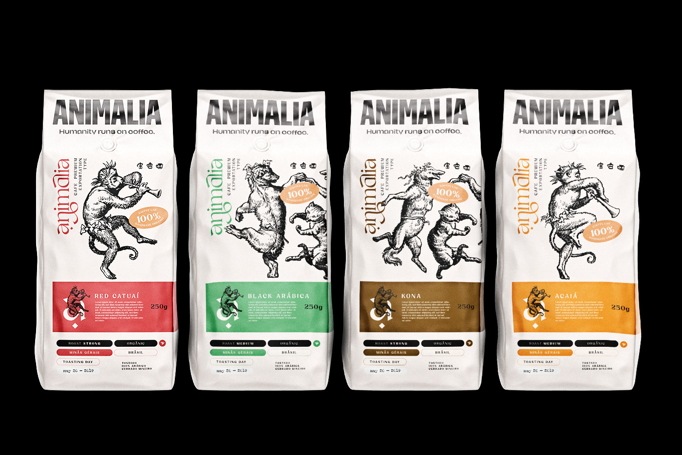
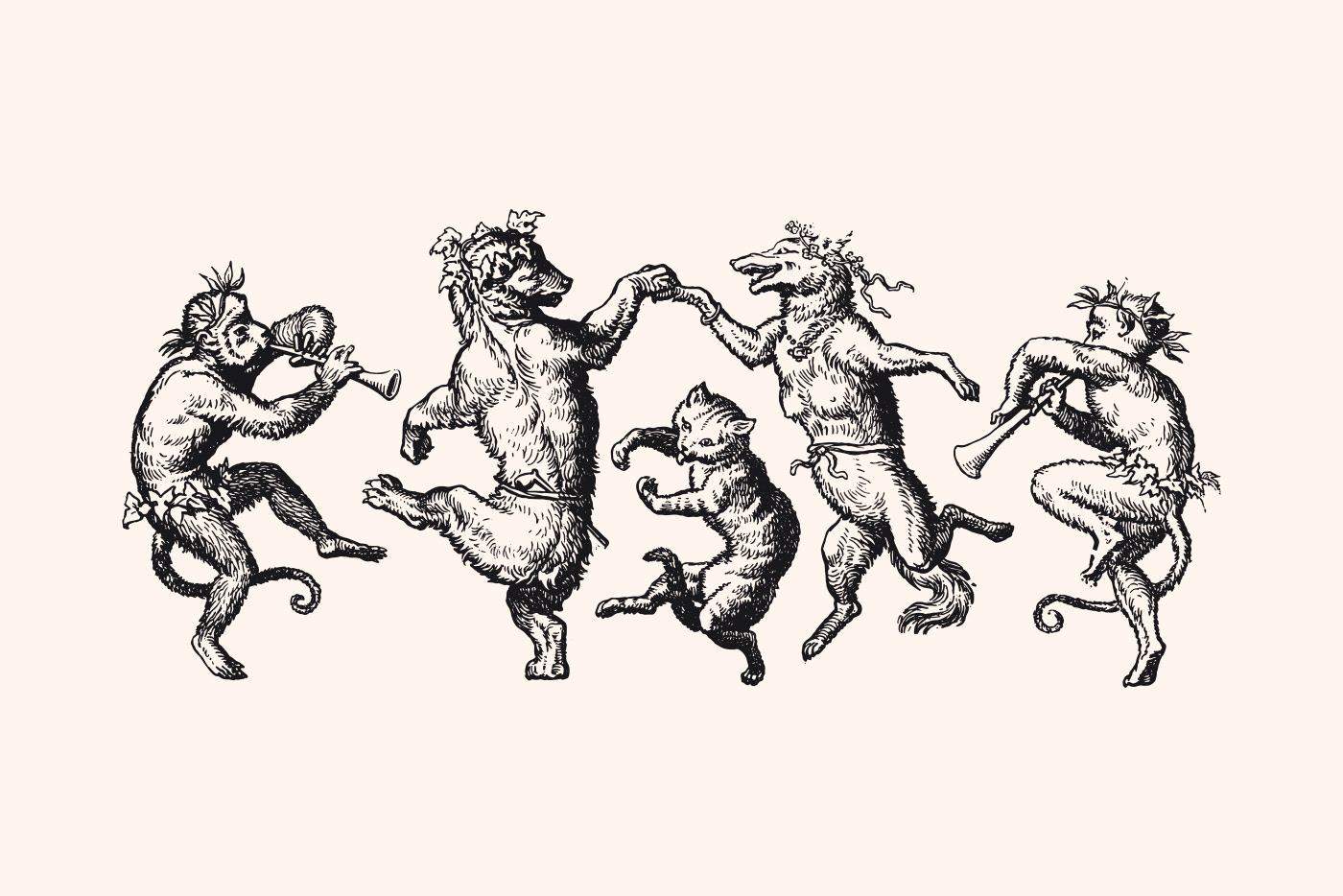
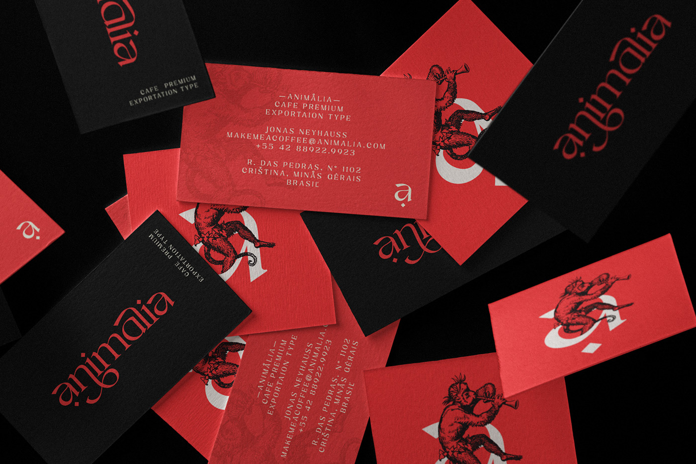
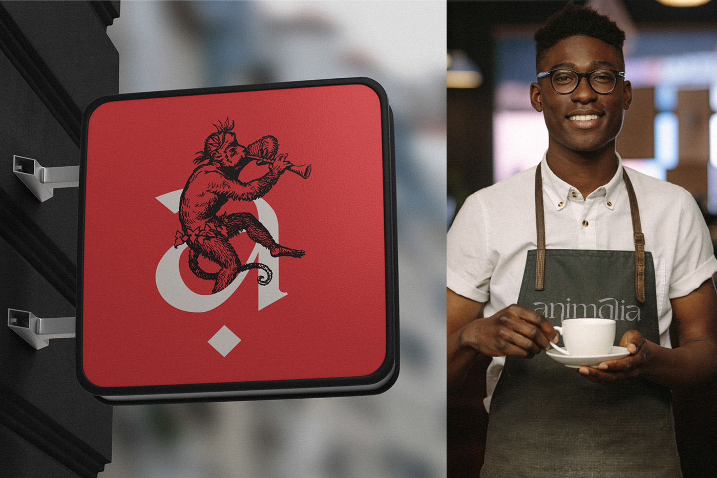
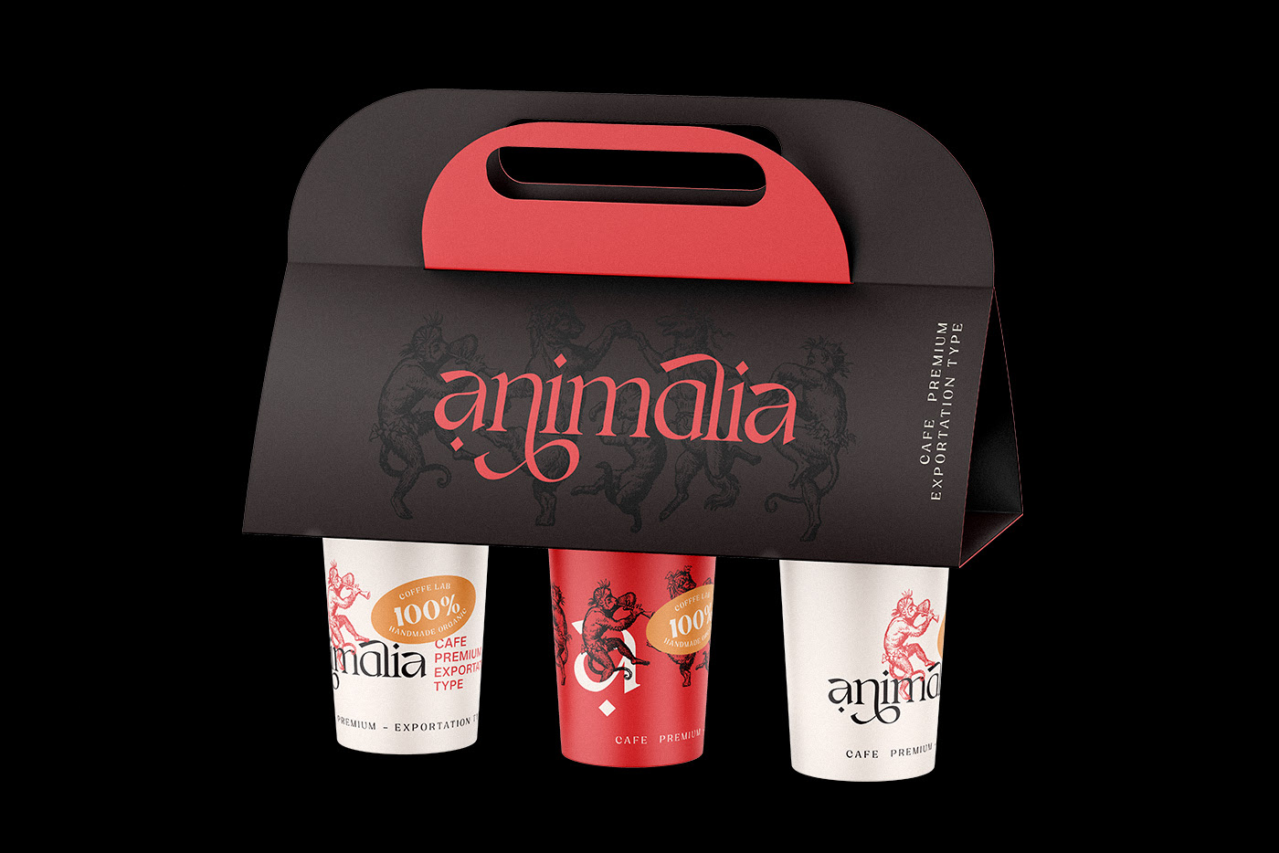
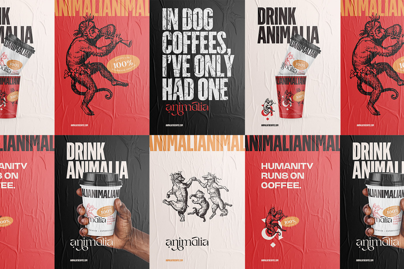
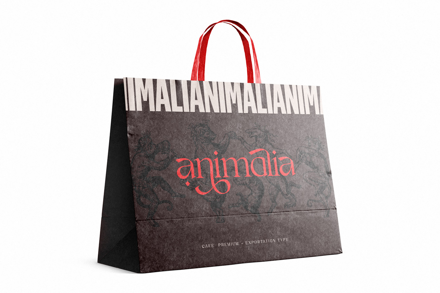
Classic gravure printing style illustrations are what initially gravitated me towards this project that I found on Behance. Animals dance and anthropomorphize into jovial expressions of the product giving the brand personality and uniqueness. While they are absolutely wonderful, the notable elements of the design do not end there.
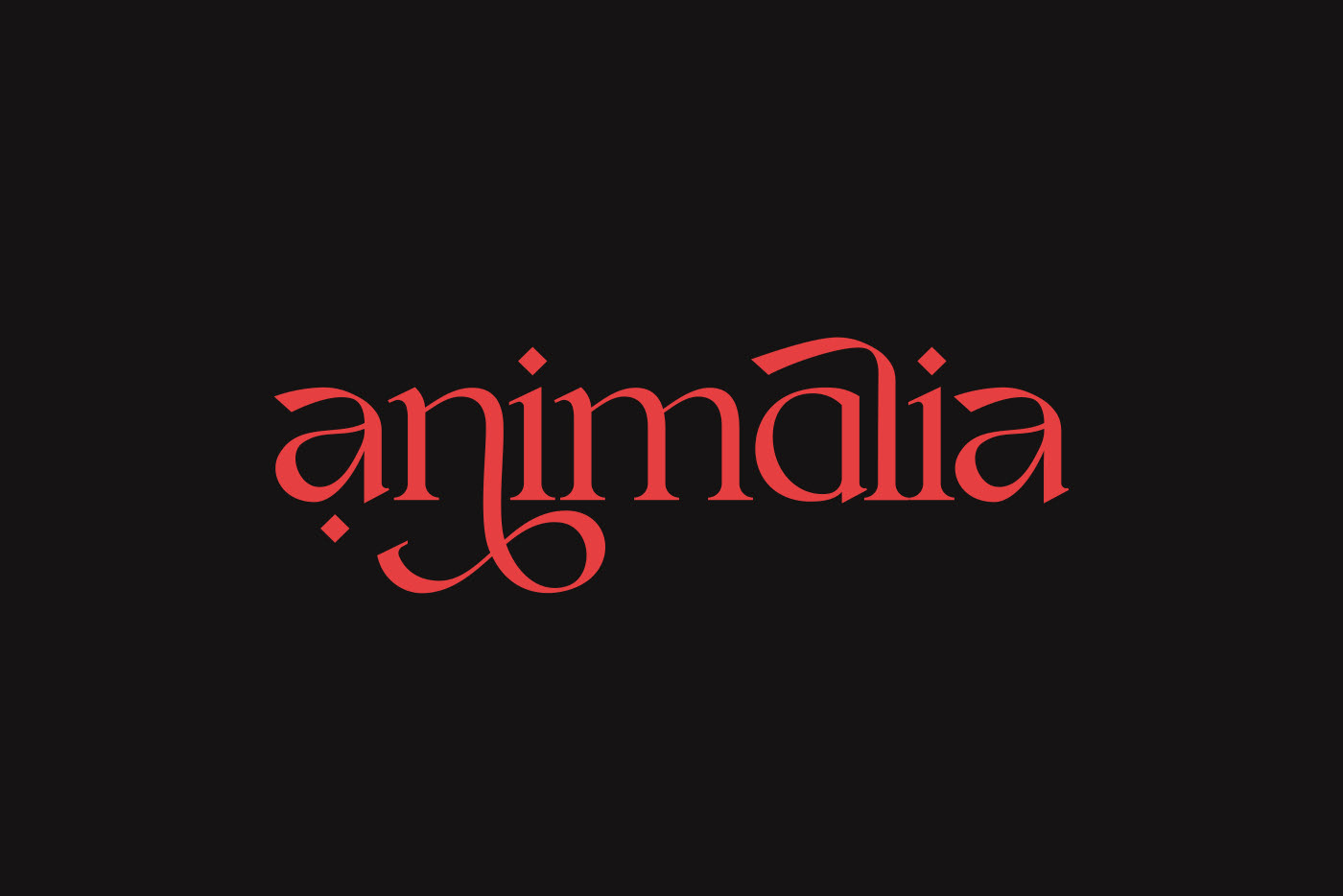
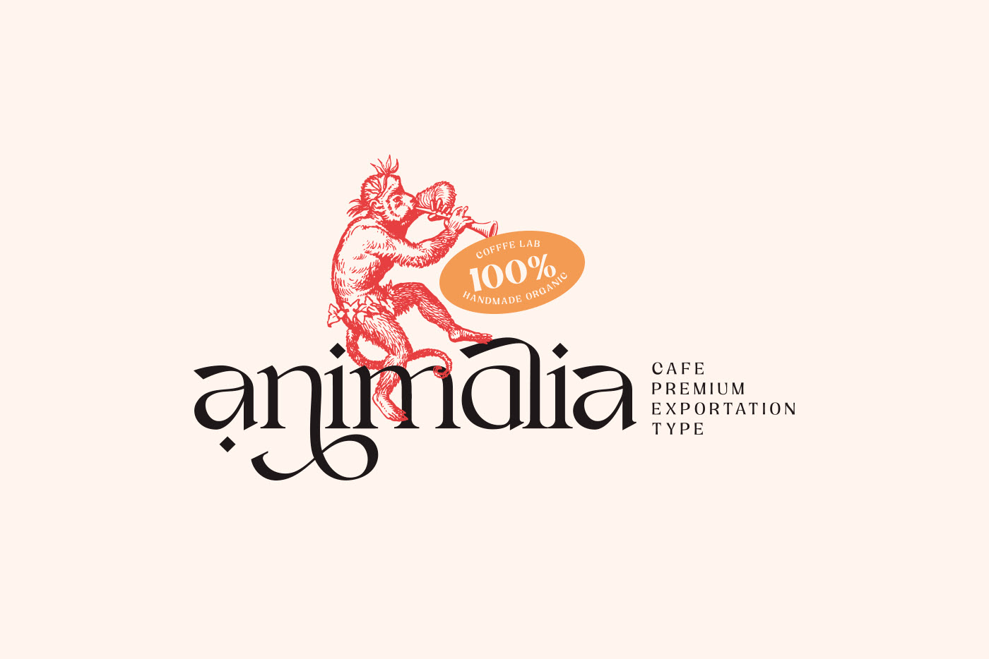
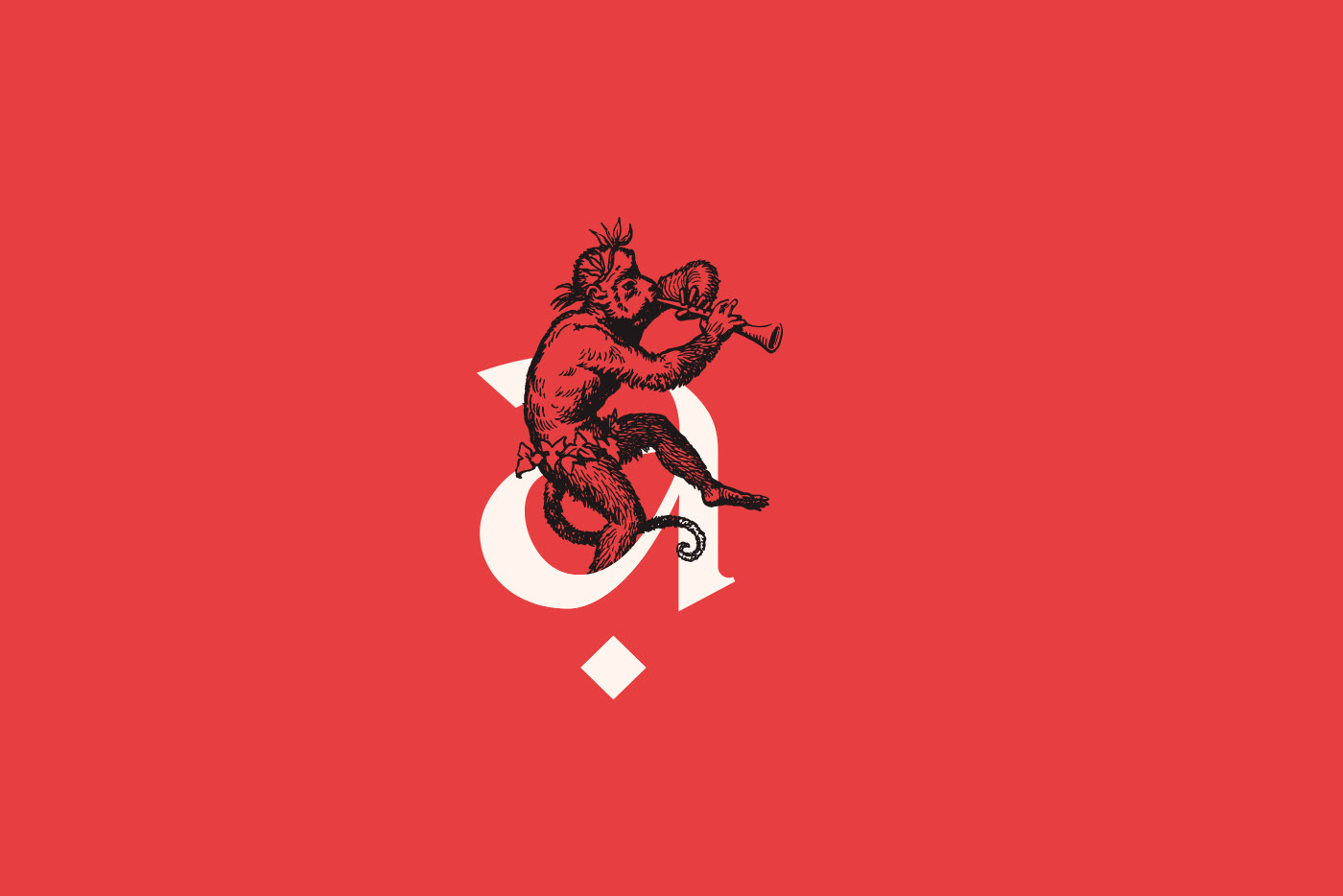
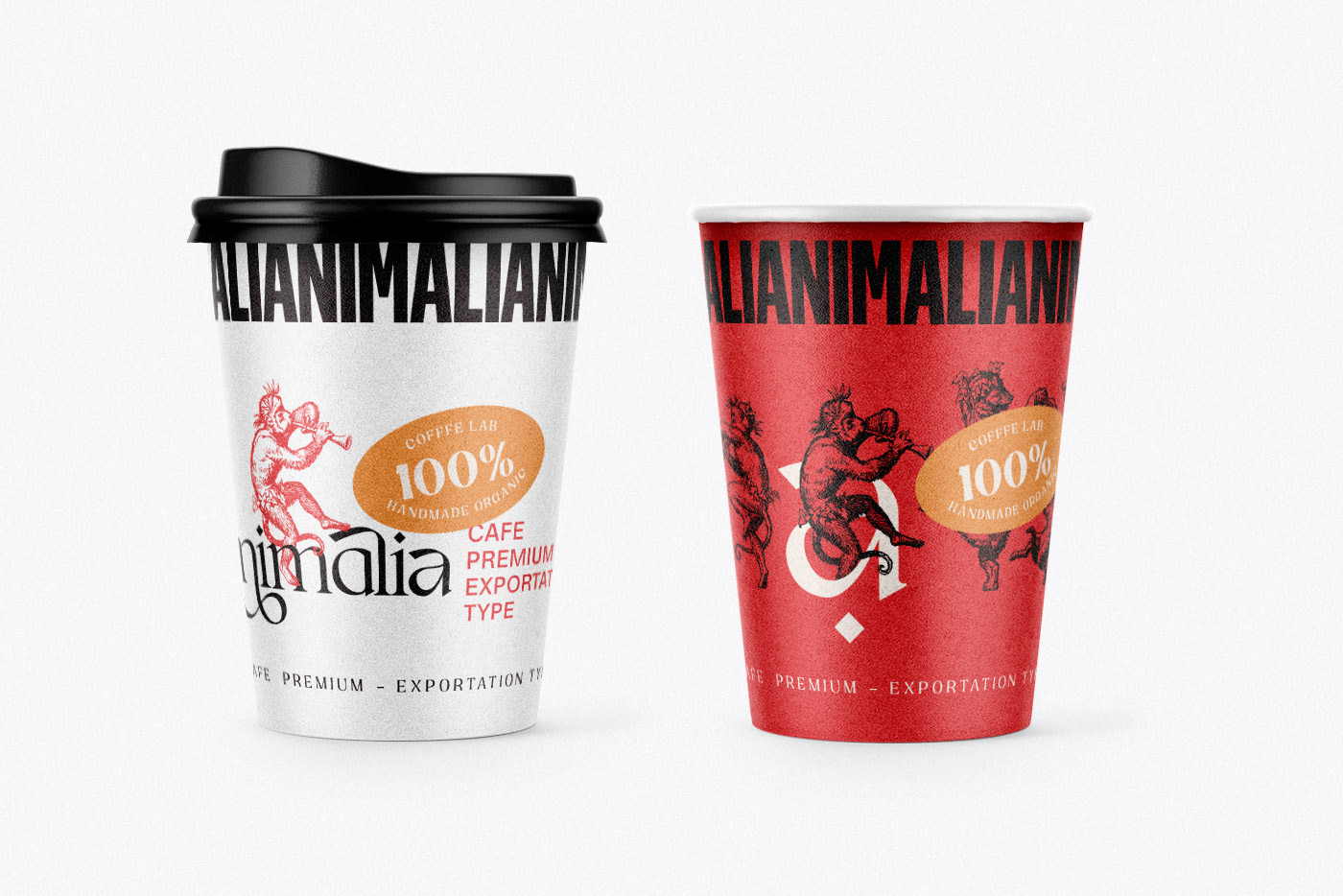
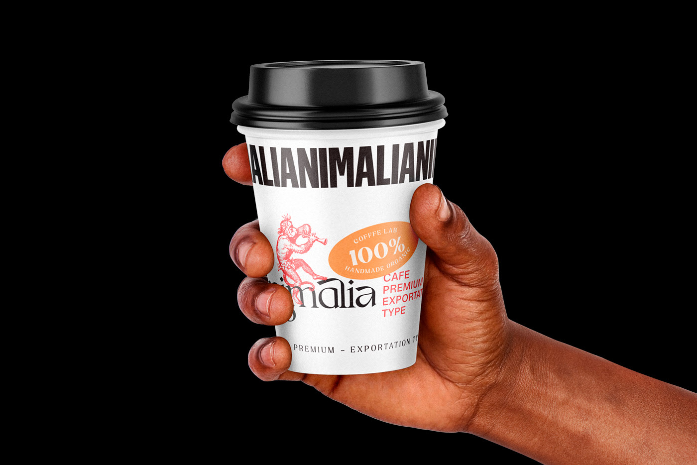
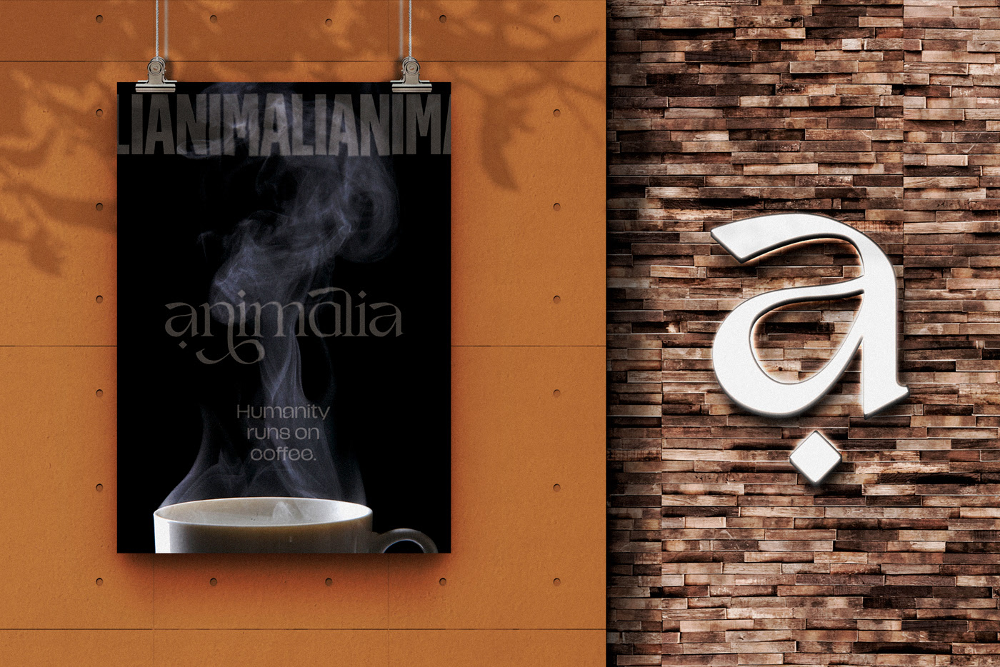
The core typography for the Animalia brand is just as jovial and expressive. Despite first glance at the packaging where one could mistake the condensed grotesque typography as the logotype, the brand identity is actually spearheaded by a gorgeous serif typography design. It clearly takes influence from Arabic mixed with pre-movable type era calligraphy. This furthers the brand’s vibe as one derived from respect for the origins of coffee.
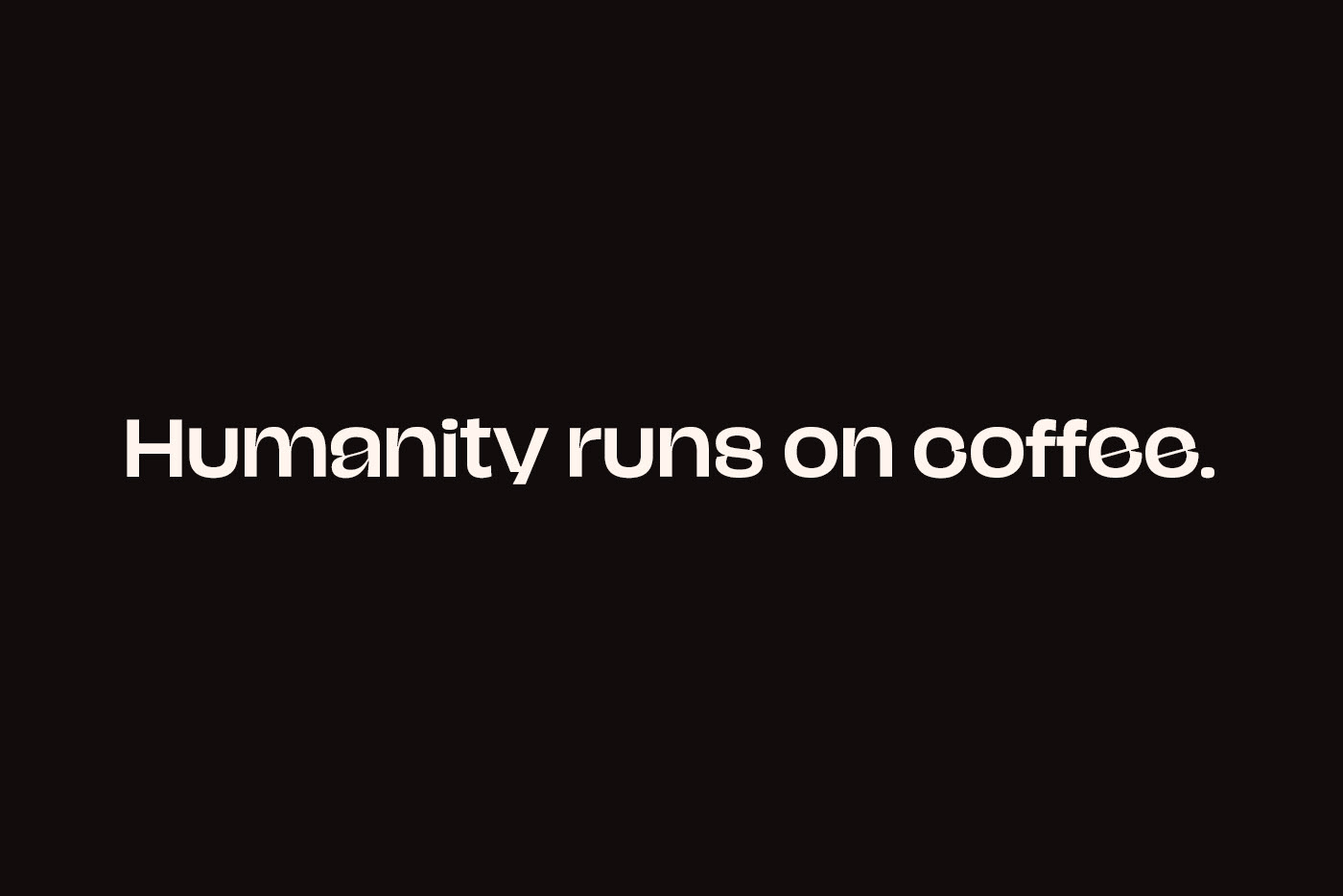
My only gripes with the design applications are as follows. The brand seems to peak early with the design elements and falls into a repetitive pattern of applying a “kit of parts” to every touchpoint. There are too many typefaces and types used throughout the various touchpoints. I see all caps, sentence case, bold, and regular weights. I see a condensed grotesque family, a quirky san-serif family that’s slightly extended, and, of course, the brand typography.
I don’t believe these criticisms harm the overall brand in any measurable way, but I do think this brand could realize an even higher level of impressiveness if the notable gripes were addressed.
Overall, a wonderful project and something Matheus Corseuil should be very proud of.
Designed by Matheus Corseuil
