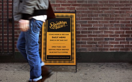
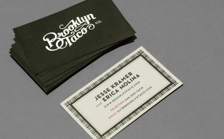
A taco joint in Brooklyn, NY isn’t a bad idea, but Tag Collective took Brooklyn Taco‘s identity to a new place, helping the taco eatery become at home in Brooklyn while serving up a really delicious taco. Using a script that is easy on the eye, but identifiable with tattoos of old, Brooklyn Taco immediately is given a vintage Brooklyn look. The use of mustard yellow as a central color softens up the logo while also drawing to mind the color of corn tortillas. The black used in the outside signage and on most printed materials is graphic, resembles the craftiness of screen printing and in the case of the invitation inside their place, a playbill isn’t far from mind.
The Forktales Podcast™: Interviews with restaurant industry leaders and visionaries
Restaurant and advertising industry headlines and thinking
Reviews of restaurant experiences from around the globe
Reviews of our favorite design, business, & restaurant books
Our favorite typography and fonts
Inspiration in your inbox
Get the latest inspiration in your inbox every Monday morning, for FREE!
"*" indicates required fields


