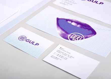
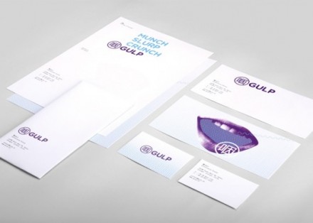
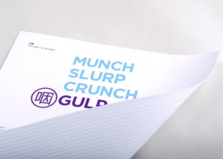
Murray Batten’s design work of stationary and an ad campaign for Chinese convenience store Gulp accomplishes one of the primary goals of branding, especially when doing work that will appear in a foreign country. Batten’s neon purple images along with the bold “Gulp” lettering works because it captures the eye, but Batten’s overall concept fits with Chinese culture nicely. Batten also incorporates other words like “Munch” and “Crunch” to represent the tastiness that is Gulp. With his work, Batten achieves the goal of giving a convenience store an image that is desirable and draws people in.
The Forktales Podcast™: Interviews with restaurant industry leaders and visionaries
Restaurant and advertising industry headlines and thinking
Reviews of restaurant experiences from around the globe
Reviews of our favorite design, business, & restaurant books
Our favorite typography and fonts
Inspiration in your inbox
Get the latest inspiration in your inbox every Monday morning, for FREE!
"*" indicates required fields


