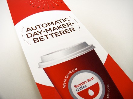
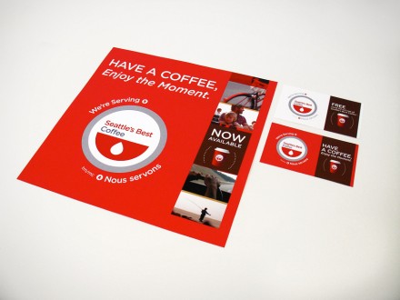
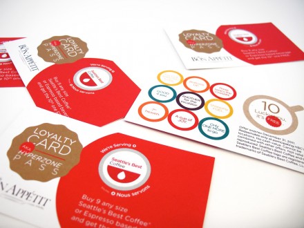
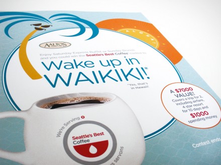
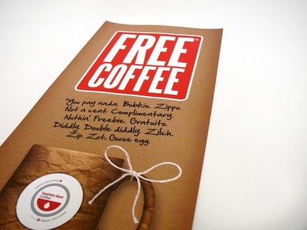
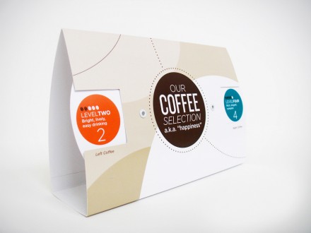
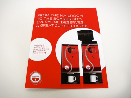
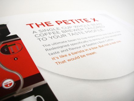
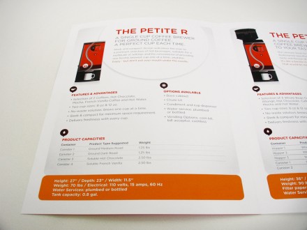
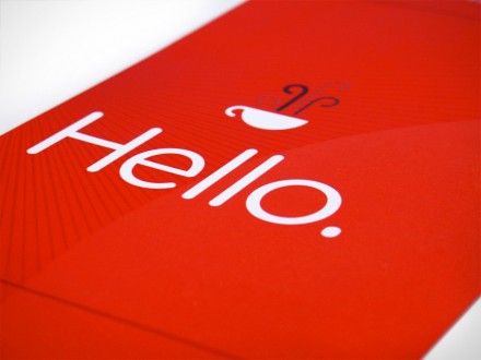
When Starbucks purchased Seattle’s Best Coffee in 2003, the coffee Goliath hoped to use SBC’s access to additional consumer channels to help grow Starbucks’ portfolio. Starbucks wanted SBC to operate as its own brand to continue the traditions and loyalty that had already been established. One of Catherine Bourdon‘s jobs was to create visual tools and marketing material for SBC’s Canadian channels that serve the brand’s coffee. Locations ranging from gas stations to hotels were to use the material and Bourdon delivered a logo-first package that ensures a consistent connection to SBC. The material is bright and engaging with a prominent use of the color red. Clever use of sayings and slogans seems to be increasingly popular and Bourdon hits on a good one “Automatic Day-Maker-Betterer”.
The Forktales Podcast™: Interviews with restaurant industry leaders and visionaries
Restaurant and advertising industry headlines and thinking
Reviews of restaurant experiences from around the globe
Reviews of our favorite design, business, & restaurant books
Our favorite typography and fonts
Inspiration in your inbox
Get the latest inspiration in your inbox every Monday morning, for FREE!
"*" indicates required fields

