Simple Branding For An Artisian Bakery

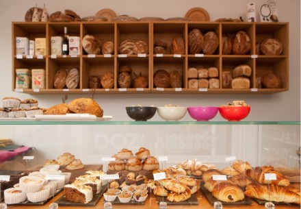
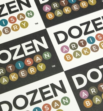
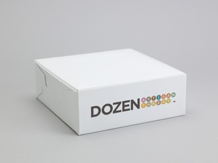
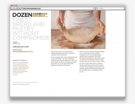
Dozen is an artisan baker and The Cl!ck gave them an identity to back up their delicious handmade breads. While artisan bakers have been around for ages, Dozen wanted a modern look that gave them a hip edge. The 13 circles that spell out “artisan bakery” beneath their name in the logo feature soft colors, some of which match the bread itself. The use of the floating circles is a design element not used as frequently these days with the emergence of Photoshop tricks and whimsical shapes among branding marks. The logo works because it’s simple. Dozen only wants to let potential consumers know what they do and let their product do the rest of the branding work.

Dozen

Dozen-1

Dozen-2

Dozen-3

Dozen-4

Dozen-5


Discuss this Project

Leave a Reply

This site uses Akismet to reduce spam. Learn how your comment data is processed.

The Forktales Podcast™: Interviews with restaurant industry leaders and visionaries

Restaurant and advertising industry headlines and thinking

Reviews of restaurant experiences from around the globe 

Reviews of our favorite design, business, & restaurant books

Our favorite typography and fonts

Inspiration in your inbox

Get the latest inspiration in your inbox every Monday morning, for FREE!

"*" indicates required fields

This field is for validation purposes and should be left unchanged.

Delicious Bits in your Inbox!

Get the latest and greatest content delivered to your inbox for free!

"*" indicates required fields

This field is for validation purposes and should be left unchanged.