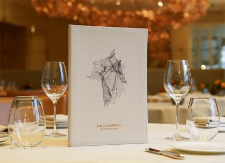
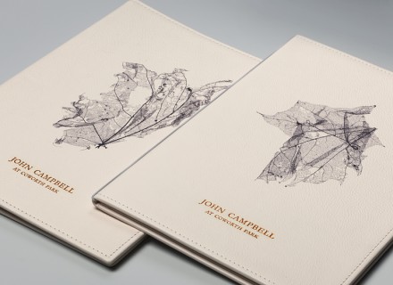
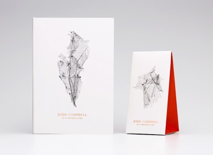
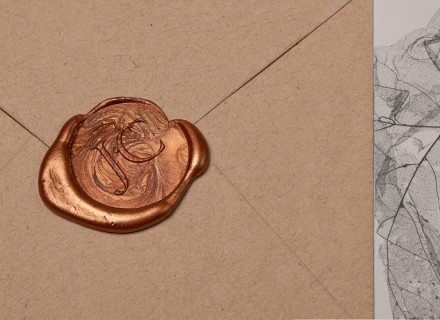
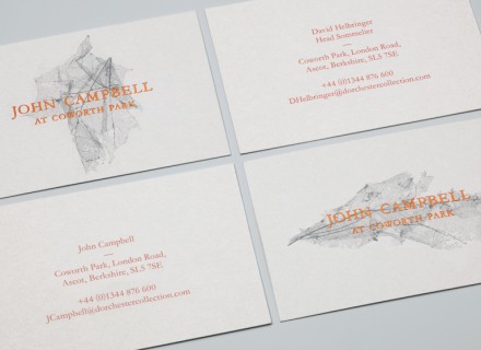
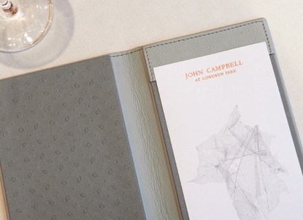
London-based And Smith fueled the branding for John Campbell at Coworth Park, an upscale hotel and spa in the English country of Berkshire and home to the award-winning chef’s restaurant that bears his name. Most of the branding comes in the form of menus, table tents, business cards and stationary. The logo is dramatic and features an abstract, blueprint-like print of a leaf. Paired with the stark white background used on most of the material, it pops and resembles form taking shape. It’s got the drama necessary and it has an organic feel as well.