Second Home’s Softly Masculine Image

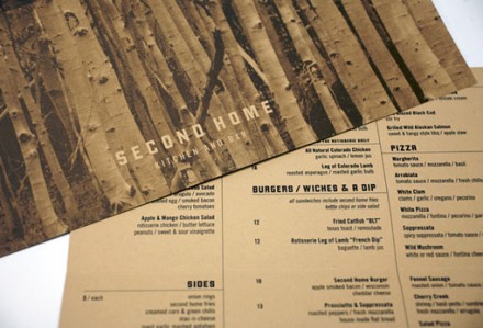
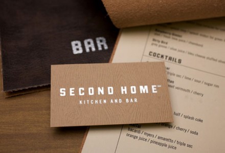
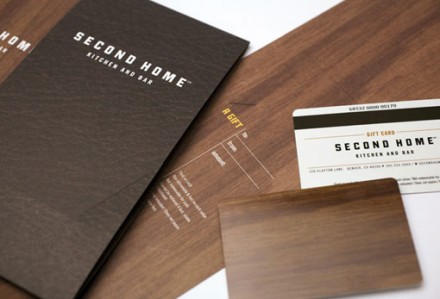
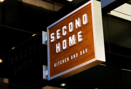
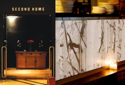
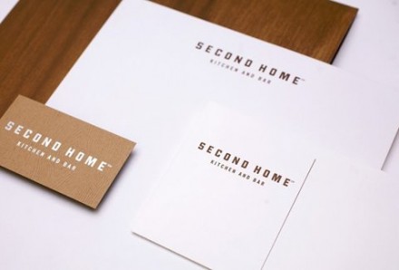
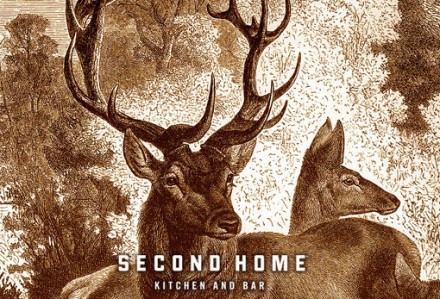
Many restaurants get away with allowing community or regional characteristics to influence their branding, but if your restaurant is located in the mountains, your options become limited and not always so appealing. Designer Bryant Ross handled Second Home Kitchen & Bar in Cherry Creek, Colorado’s branding and he did a nice job avoiding some of the campy themes of eateries in mountainous areas. Much of the collateral is done in a sleek fashion with shades of darker browns and wood motifs throughout.  These textures give the brand a high-end feel but remain consistent with its surroundings of nature and soft winter feelings. One of the posters with the blocked lettering of the logo features an old-fashioned hand drawing of deer. Ross treated this image carefully and pulled off a masculine feel for Second Home without alienating any potential customer bases.
bryantross_01

bryantross_02

bryantross_03

bryantross_04

bryantross_05

bryantross_06

0ae907f9a10b45cb7dd8c19f81d491c220b5c4fd_m

Discuss this Project

Leave a Reply

This site uses Akismet to reduce spam. Learn how your comment data is processed.

The Forktales Podcast™: Interviews with restaurant industry leaders and visionaries

Restaurant and advertising industry headlines and thinking

Reviews of restaurant experiences from around the globe 

Reviews of our favorite design, business, & restaurant books

Our favorite typography and fonts

Inspiration in your inbox

Get the latest inspiration in your inbox every Monday morning, for FREE!

"*" indicates required fields

This field is for validation purposes and should be left unchanged.

Delicious Bits in your Inbox!

Get the latest and greatest content delivered to your inbox for free!

"*" indicates required fields

This field is for validation purposes and should be left unchanged.