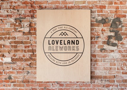
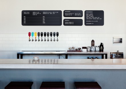
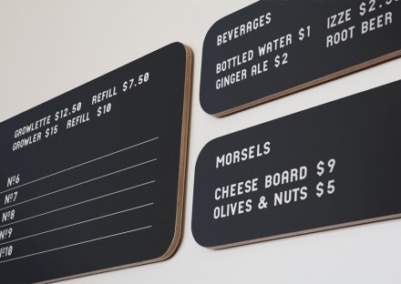
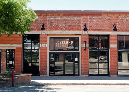
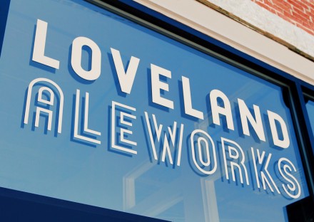
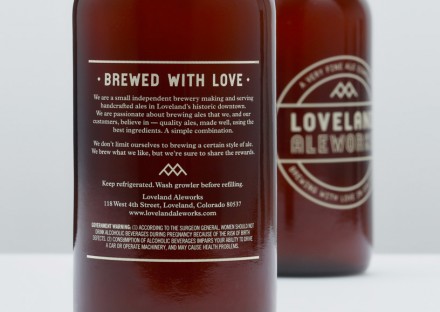
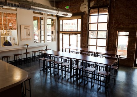
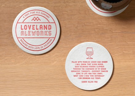
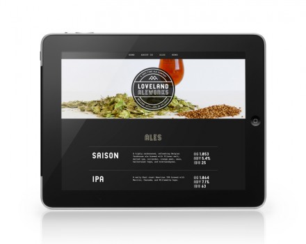
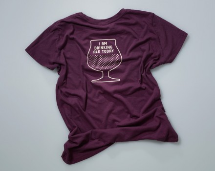
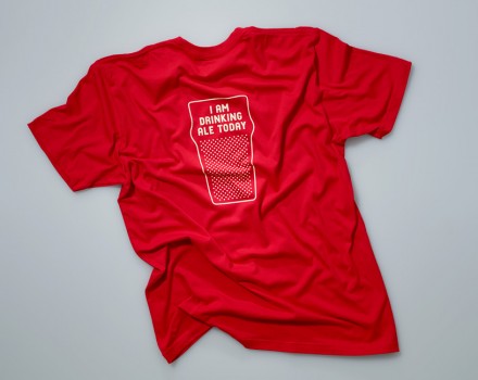
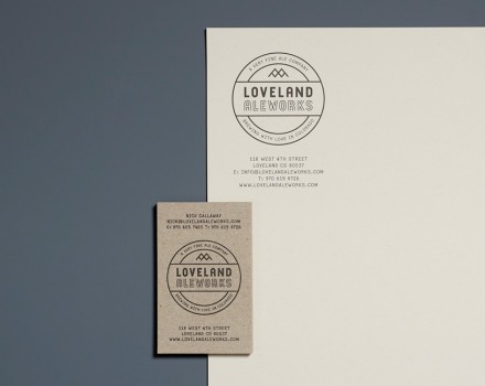
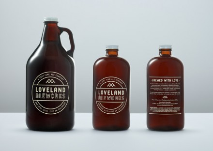
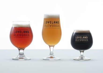
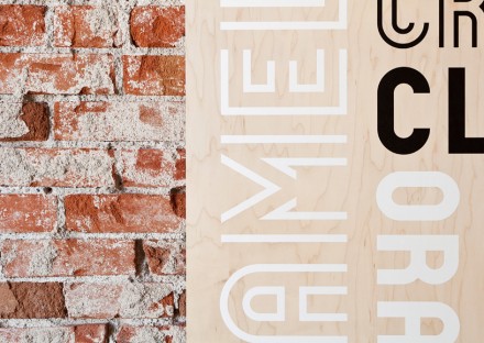
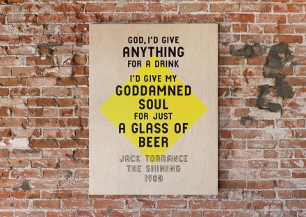
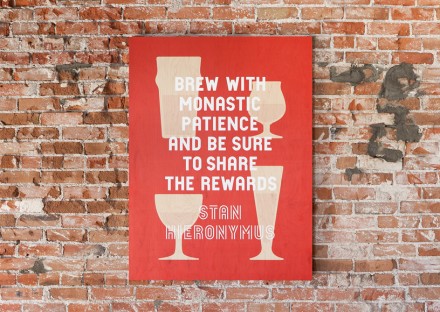
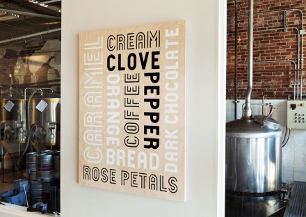
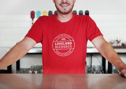
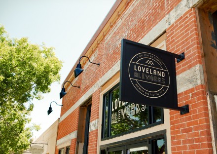
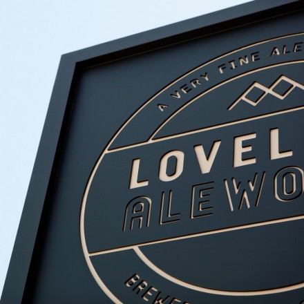
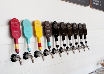
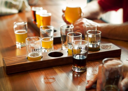
Loveland is “a very fine ale company” and they are a very fine ale company indeed because the branding that Manual put forth is stellar for the Loveland, Colorado microbrewery and tasting room. Most brand makers listen closely to their clients as they follow their creative process to create a strong image. In the case of Loveland Aleworks, Manual clearly had their ears open. Loveland wanted the handcrafted aspect of their passion, brewmaking, to come across in the branding as well as influences from the history and culture of the Loveland community, the last stop heading into Rocky Mountain National Park. Loveland also has a strong train-related history, making the badge-like logo really appropriate. Much of the material used for the interiors of Loveland are reclaimed or handmade helping the brewery have a soft, welcoming feel in addition to the do-it-yourself vibe. This branding is a great example of what can happen when you listen closely to your client and all the details they can bring to the overall creation.
The Forktales Podcast™: Interviews with restaurant industry leaders and visionaries
Restaurant and advertising industry headlines and thinking
Reviews of restaurant experiences from around the globe
Reviews of our favorite design, business, & restaurant books
Our favorite typography and fonts
Inspiration in your inbox
Get the latest inspiration in your inbox every Monday morning, for FREE!
"*" indicates required fields

