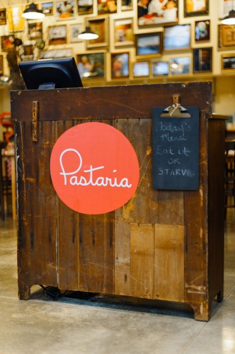
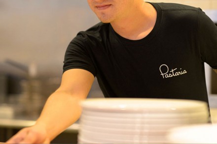
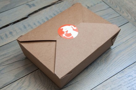
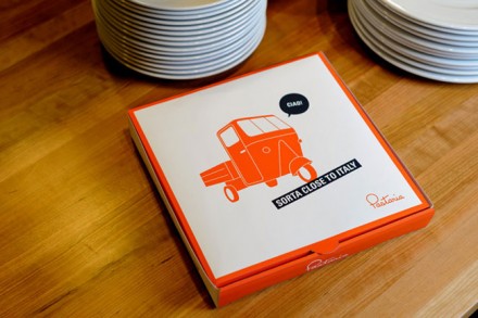
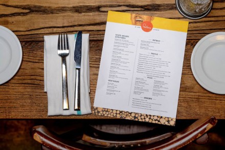
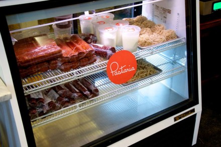
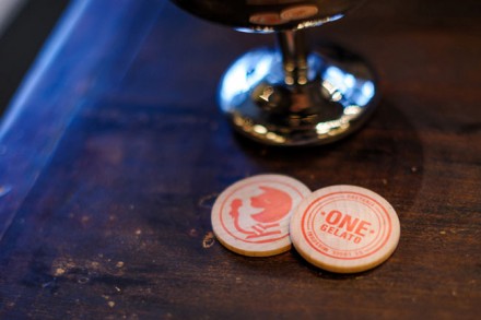
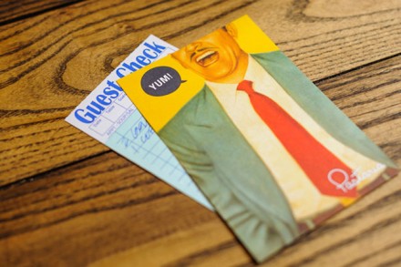
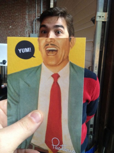
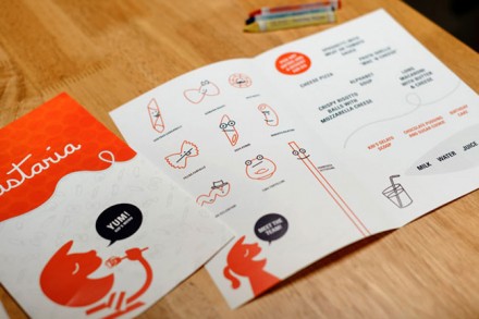
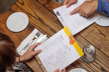
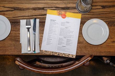
I can imagine the initial meeting between Pastaria, a St. Louis Italian place, and designers Atomic Dust went something like this: Atomic Dust asks Pastaria what things come to mind when they imagine their brand and Pastaria shrugged their shoulders as if to say “I don’t care, as long as it’s cool.” Perhaps they knew their food could back up a cool brand and they just wanted Atomic Dust to do what they do. The result is an “unpretentious attitude” that is reflected in its mysterious three-wheeled car and its “sorta close to Italy” slogan. Both are instant icons for Pastaria and the entire branding takes shape from there. The typeface in the logo was hand-drawn and created by Atomic Dust for Pastaria and sits in a circle of a peach-ish color. Pastaria offers fun images and feelings in subtle forms nearly everywhere you look. For the grand opening, customers could trade in Pastaria-branded wooden nickels for gelato. There’s also the image of the slight mustachioed man –also suited– on a postcard delivered with the check, as well as other locations around the restaurant. It’s the kind of thing that will sit in your car for a week and you or your company will make at least one funny joke about it and in that way Pastaria stays with you. Kudos to Atomic Dust for taking the easy-going and creative feelings from Pastaria and delivering a strongly branded product.

