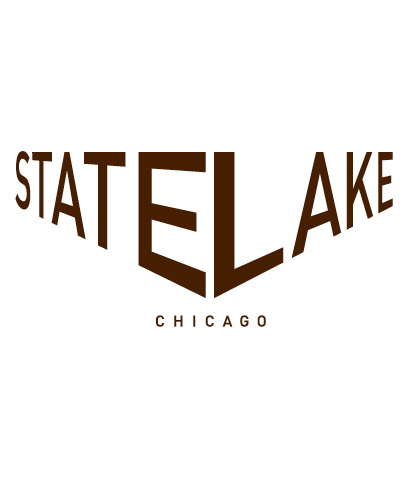
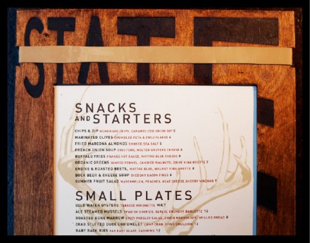
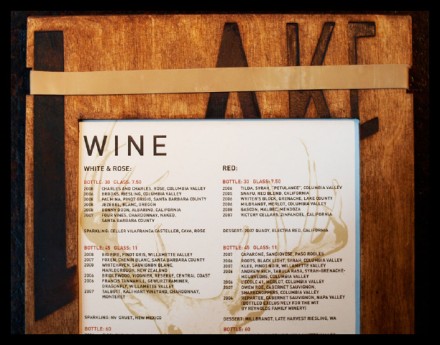
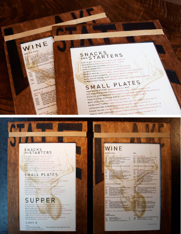
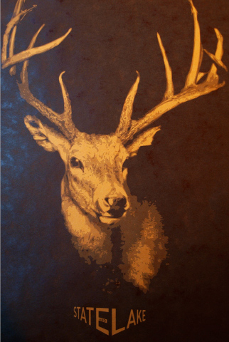
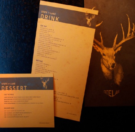
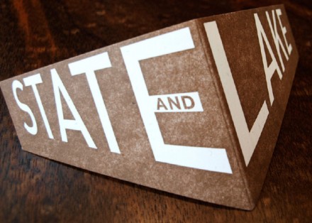
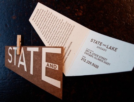
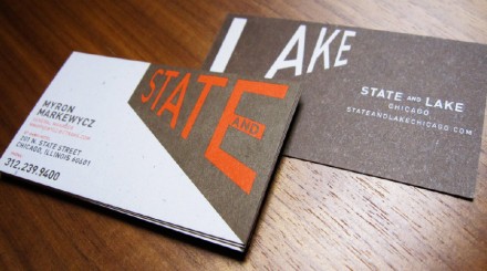
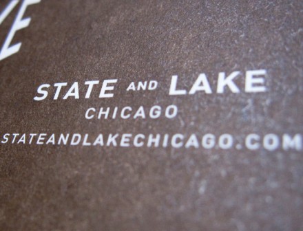
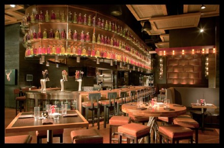
We’ve covered some recently successful attempts at branding using masculine imagery of Mother Nature and Chicago’s State and Lake is another to add to the list. Conceptualized and designed by Boy Burns Barn, State and Lake is a gastropub, as you’d guess, at the intersection of State and Lake Streets. As Boy Burns Barns explains, a well-known intersection in one of the world’s great cities should be used and used liberally. The logo is a simple one, using a basic typeface to spell out the name, but the two words meet to form a point, reminiscent of a street intersection. The interior is comfortable and warm and features significant branding that should now be called Field & Stream branding. Deer, wood-burned menus and faded paper make up the branding, but the interiors stray a little toward more modern wood-based furnishings to help balance things out. The total result for State and Lake is an image that is strong with enough quirks to be memorable.