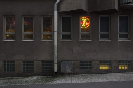
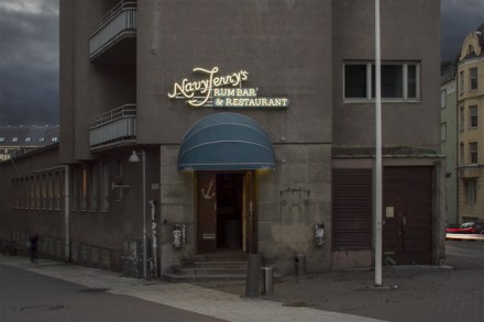
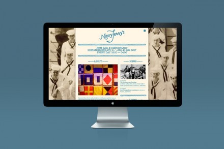
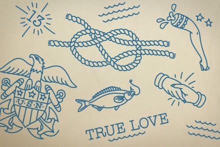
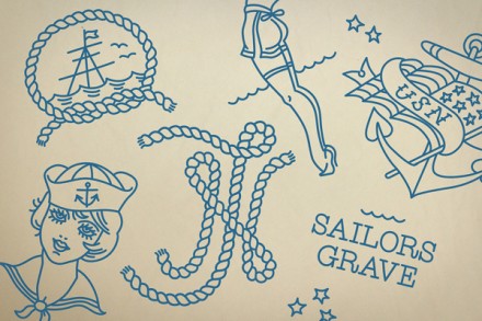
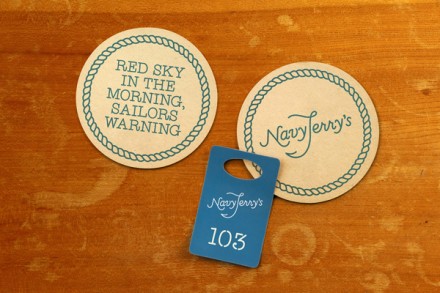
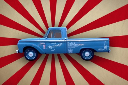
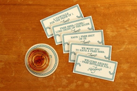
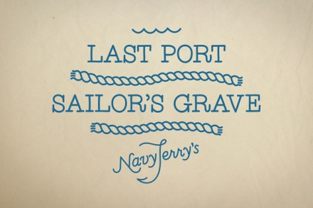
Navy Jerry’s is a rum bar and restaurant in Helsinki and like the name implies there is a strong nautical theme running through this branding. The maritime look of Navy Jerry’s is somewhat light-hearted, an intentional move by branders Werklig to set Navy Jerry’s apart from the rest of the restaurants in Helsinki that are similar, and there are a few of them. Using military-inspired tattoos as a theme and the iconic light blue of the all-things maritime, Navy Jerry’s delivers the theme well, but the lighter aspects of the brand help make the restaurant appeal to a younger generation of client that is a little looser and more inclined to accept and enjoy a quirkier branding effort a food establishment. The typewriter style typeface was created exclusively for Navy Jerry’s and it’s the perfect look for a marine look with a twist.
The Forktales Podcast™: Interviews with restaurant industry leaders and visionaries
Restaurant and advertising industry headlines and thinking
Reviews of restaurant experiences from around the globe
Reviews of our favorite design, business, & restaurant books
Our favorite typography and fonts
Inspiration in your inbox
Get the latest inspiration in your inbox every Monday morning, for FREE!
"*" indicates required fields

