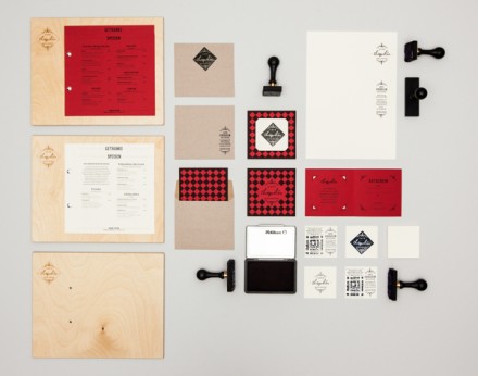
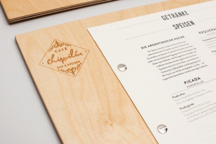
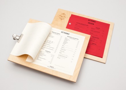
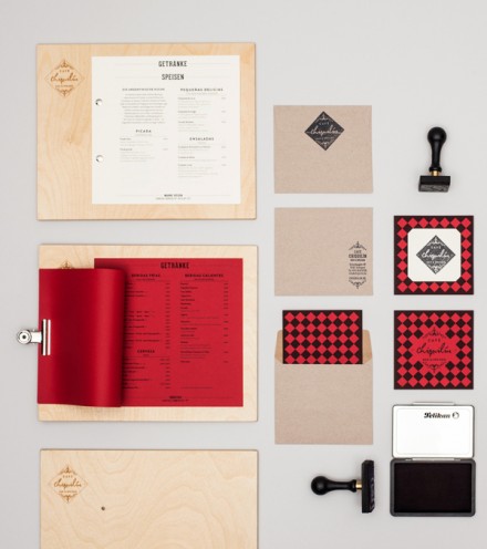
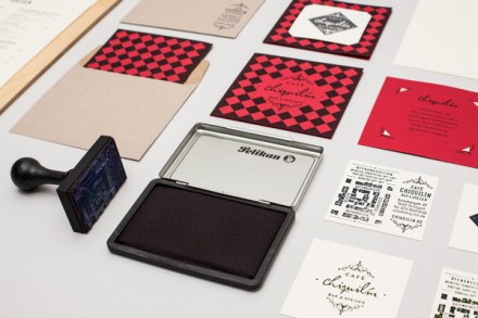
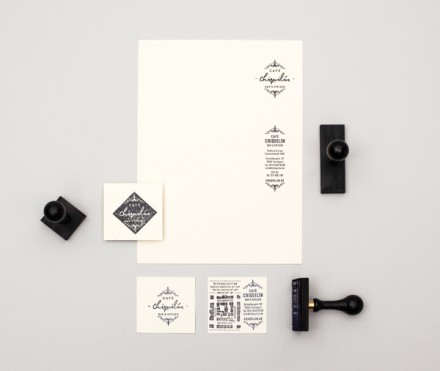
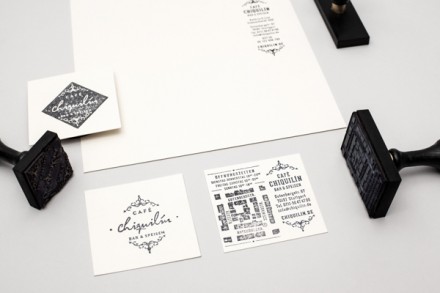
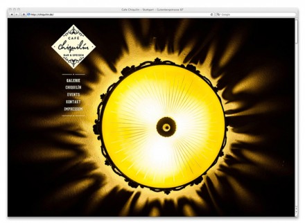
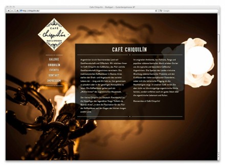
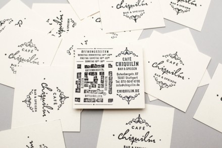
Studying restaurant branding every day, you start to pick up some themes. One thing I’ve noticed a lot is brand makers typically seem to pinpoint and narrow in on a few select ideas or images to help assist with the branding work. Usually these items serve as the jumping-off point, but they typically manage to find their way into the completed work, often repeatedly. The Argentinian coffee house Cafe Chiquilin is a prime example of this. The design group LSDK started with the location’s tiled floor and used that shape throughout the entire concept. They also used the style of new art, or art nouveau to the art insiders, as the inspiration behind the logo and the typefaces used. Art nouveau drew inspiration from the lines and forms of nature and it’s flowing nature in both lines and shapes is well established as a prime inspiration to much of what we see today. The logo uses that flowing nature to create a top and bottom border inside the diamond that encloses the name of the brand. It’s a good look and the hand-stamp elements are absolutely beautiful. Art nouveau found its inspiration from nature and Cafe Chiquilin does the same. The stamp portion of this works well with all the other flowing pieces of the brand to create a vibe that is open, organic and attractive, all really good concepts for a coffee house.
The Forktales Podcast™: Interviews with restaurant industry leaders and visionaries
Restaurant and advertising industry headlines and thinking
Reviews of restaurant experiences from around the globe
Reviews of our favorite design, business, & restaurant books
Our favorite typography and fonts
Inspiration in your inbox
Get the latest inspiration in your inbox every Monday morning, for FREE!
"*" indicates required fields



One Response