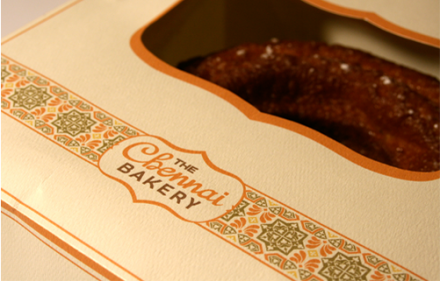
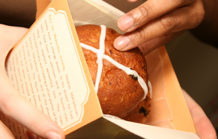
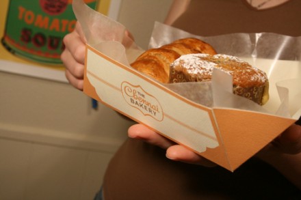
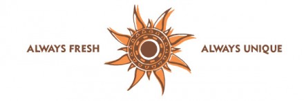
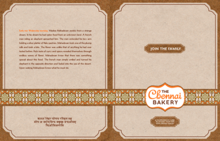
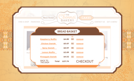
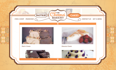
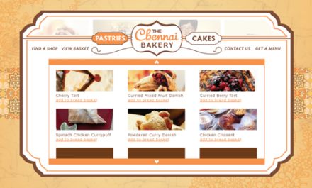
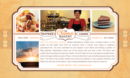
I don’t know a lot about The Chennai Bakery whose branding was imagined and completed by Ryan Cole. Without the assistance of background knowledge, I wanted to take a look at the branding job Cole did with this bakery just by the feelings it evokes and the things that catch my eye. The first thing I see is the banner behind the logo. I like how it offers symmetry in the background regardless of the surface and acts like a ribbon, completely appropriate for a bakery. The ribbon is repeated throughout the branding and ties it all together with a familiar pattern. The ribbon also works well with the badge logo of the brand, appearing like a gift tag on every item it’s applied to. The branding and logo work is effective and most importantly repeatable across a variety of mediums. I also think the use of the word “fresh” is interesting. I’ve recently been having an ongoing conversation with various folks about the use of the word “fresh” in branding and if it’s a word that is losing its real meaning. I think Cole smartly added a second item to the brand mission tagged with the logo in some of the materials. In addition to “Always Fresh” they added “Always Unique”. With a, for lack of a better word, unique slogan on the back end, they add some value to the original word. It’s a subtle trick, but I think it’s really smart.


