Branding An Icon For The Future

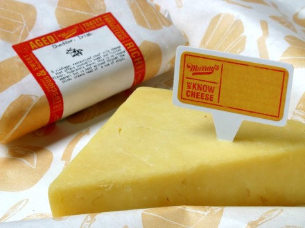
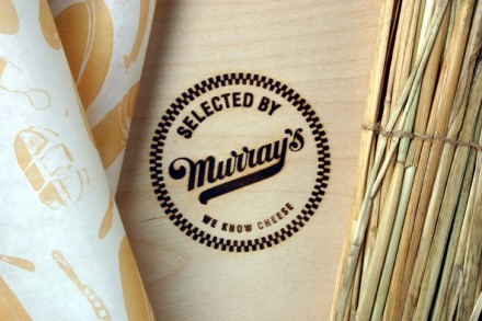
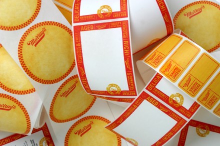
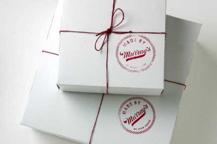
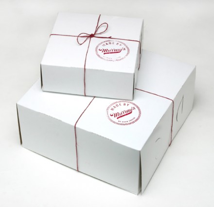
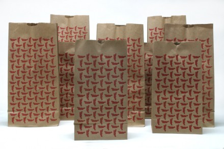
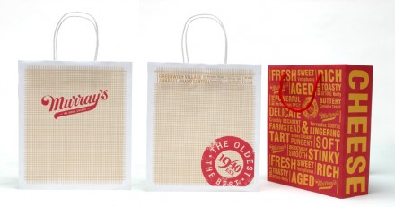
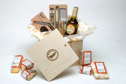
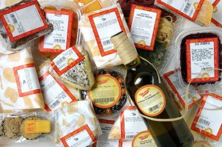
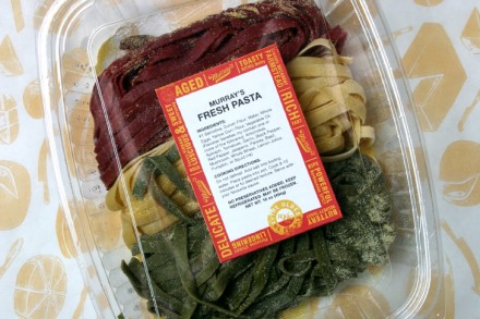
If you can make it in New York City, you can make it anywhere, as someone said once. All the successful people outside of New York may take issue with that statement, but the truth is, NYC is a competitive market for nearly anything, particularly food. If you can survive there, like Murray’s Cheese has for 73 years, you’ve probably got a good product on your hands. Pirtle Design updated Murray’s brand a few years ago and because Murray’s, New York’s oldest cheese shop, is an icon of the city, very little was needed. They updated a little here, modernized a little there and prepared Murray’s for another run through a century. Murray’s has begun expanding so the work Pirtle did was necessary to move the brand along into a more national eye. Tweaks like the packaging stamps and fun, branded handle shopping bags position this smart brand in a category with few others.

Murrays_02

Murrays_04

Murrays_21

Murrays_25

Murrays_26

Murrays_27

Murrays_29

Murrays_30

Murrays_31

Murrays_32

Murrays_33


Discuss this Project

Leave a Reply

This site uses Akismet to reduce spam. Learn how your comment data is processed.

The Forktales Podcast™: Interviews with restaurant industry leaders and visionaries

Restaurant and advertising industry headlines and thinking

Reviews of restaurant experiences from around the globe 

Reviews of our favorite design, business, & restaurant books

Our favorite typography and fonts

Inspiration in your inbox

Get the latest inspiration in your inbox every Monday morning, for FREE!

"*" indicates required fields

This field is for validation purposes and should be left unchanged.

Delicious Bits in your Inbox!

Get the latest and greatest content delivered to your inbox for free!

"*" indicates required fields

This field is for validation purposes and should be left unchanged.