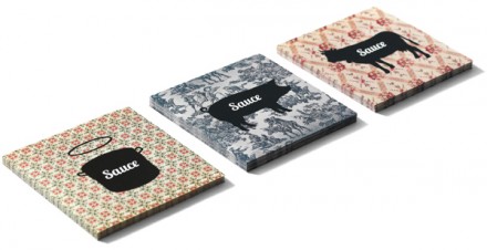
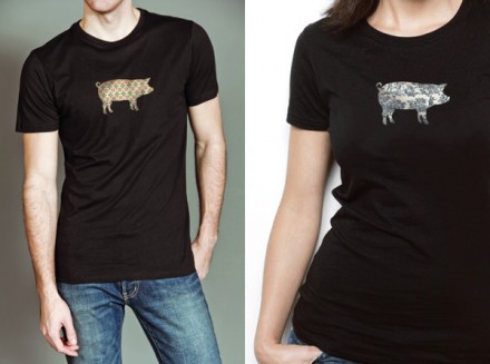
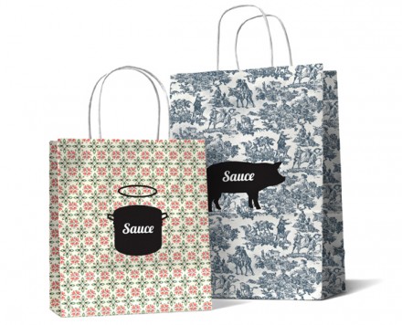
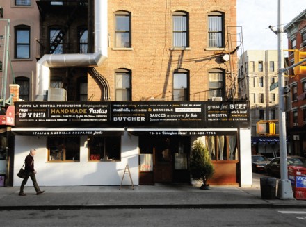
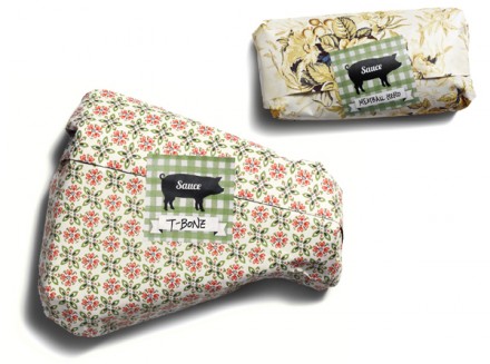
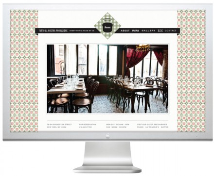
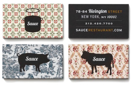
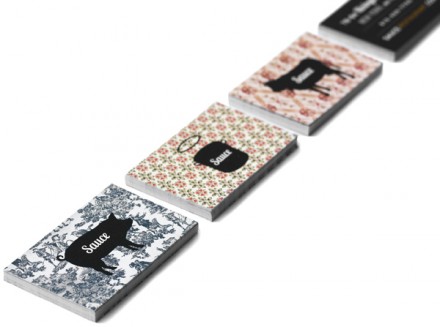
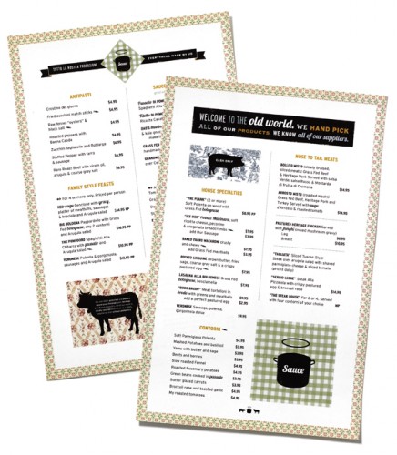
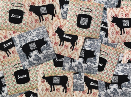
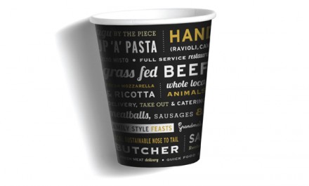
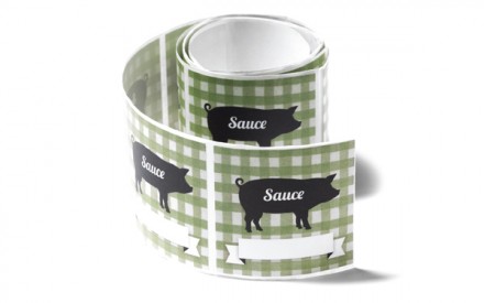
If your grandma was like mine, she had a thing for cows. Nothing dirty, just a healthy appreciation for pork. If she was like my grandma, she probably had a few cow-related knick-knacks around her place. That’s nostalgia and that’s what the branding for Sauce, a restaurant, grocer and butcher, has going for it. Created by a team of designers, Sauce creates a familiar aesthetic through recognizable icons and prints in its branding and the shop itself brings all of that iconic into the now. The store front is modeled after authentic Italian shop storefronts of New York of old, but they take the theme forward a few decades with its marquee, a black slate full of typography, another example of using words as design elements to craft a logo and/or brand. The use of pot, cow and pig icons against old-fashioned, grandmotherly prints is a nice reference to home while also providing that necessary quirk all fun brands have. It’s a well-done project, smartly conceptualized without a lot of clutter to get in the way.

