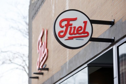
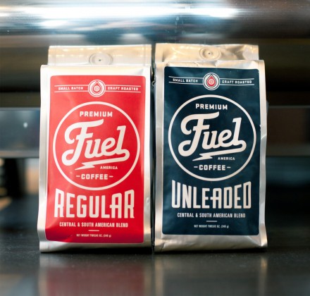
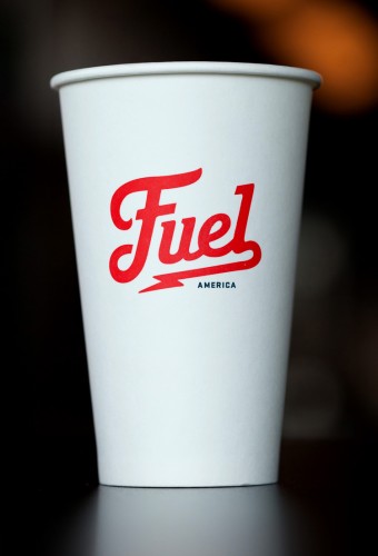
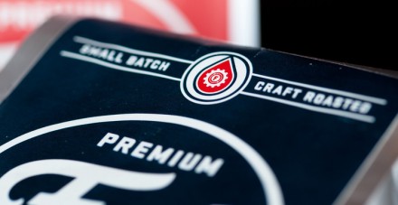
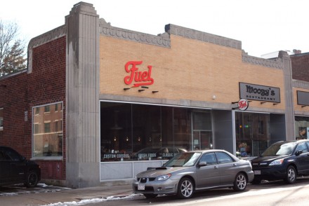
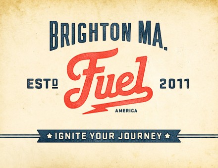
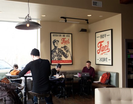
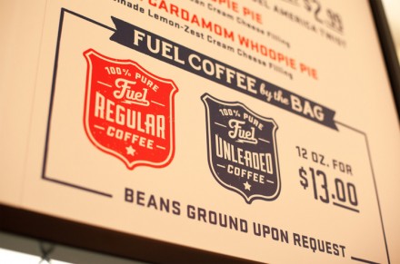
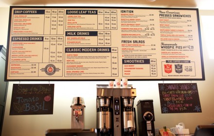
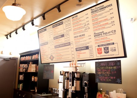
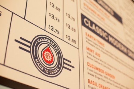
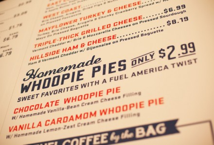
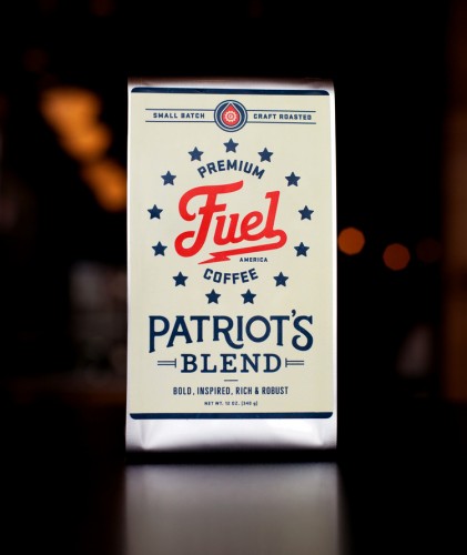
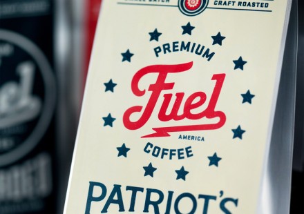
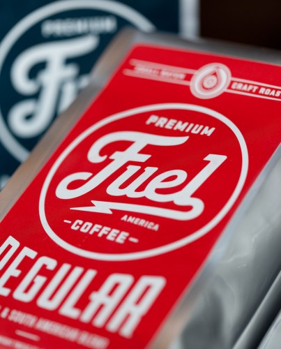
Fuel is an appropriately named Brighton, Massachusetts coffee shop that Commoner handled the branding for. First, the name: extremely fitting for a shop serving coffee, but it’s the logo I’m drawn to. This job demonstrates that a good name is not enough in the world of branding, instead a good name working in tandem with a smart logo design is the way to go. I love the vintage feel of the logo and how it draws inspiration from early gas station signs as Americans began driving cars early last century. The logo has some motion to it as well and the subtle lightning bolt in the tail of the logo is a nice touch to give the logo some added life. The logo is simple and classic in a way and has a strong presence wherever its applied. Much of the branding plays off the gas station motif, including the menu inside and the interior design accents. It’s a smart, sturdy brand that delivers a vintage American feel.

