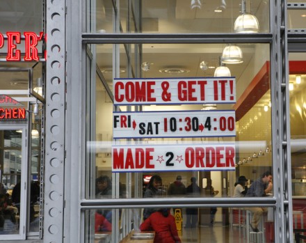
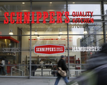
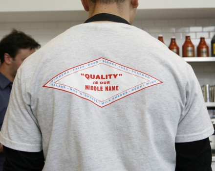
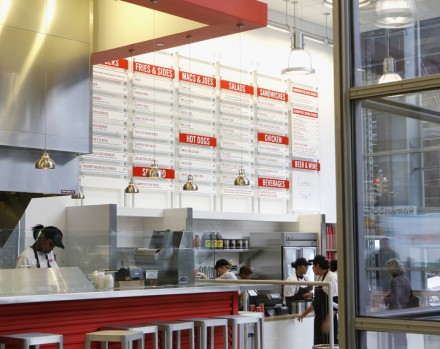
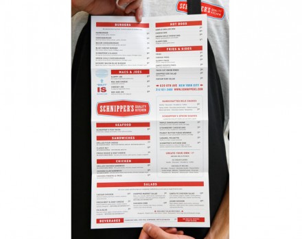
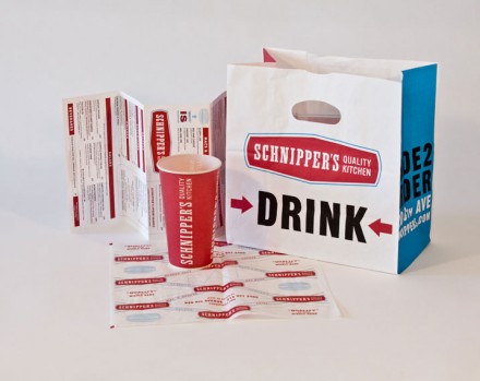
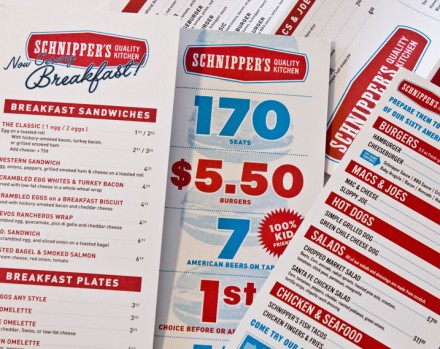
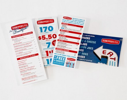
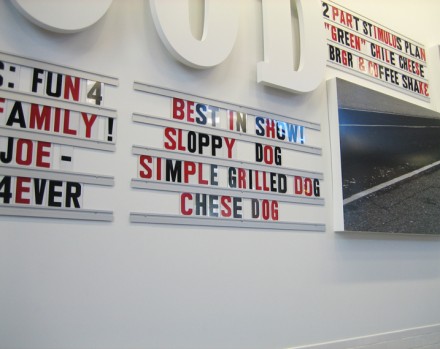
Located in the New York Times building is Schnipper’s, a fast casual burger joint with an old-school charm. Designed by Memo, Schnipper’s has the look of a modern diner with the lived-in feel of a place off to the side of Route 66. Schnipper’s specializes in comfort food, the kind of thing you’d see at neighborhood block parties and summer picnics, but they serve it with quality, as the brand modifier says. I’ve long loved the light-up marquee, especially the ones shaped like an arrow with removable letters. Much of the signage and the overall look of the branding resembles these types of marquees. It’s a fun style and Schnipper’s is helped by their location, a somewhat swank position in the city that doesn’t accept anything less than quality. While they may have elements of the community grocery store, they do everything with a polish and that keeps the brand strong. There’s a lot of Americana in this branding and the red, white and blue was an obvious choice.

