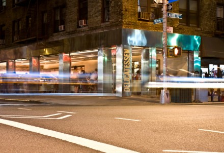
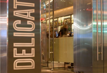
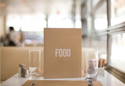
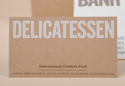
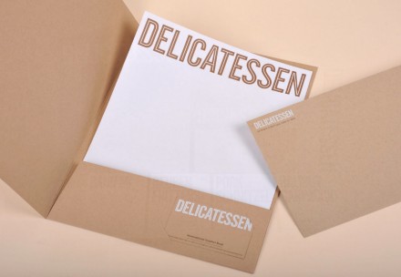
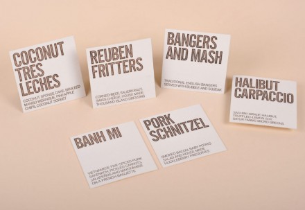
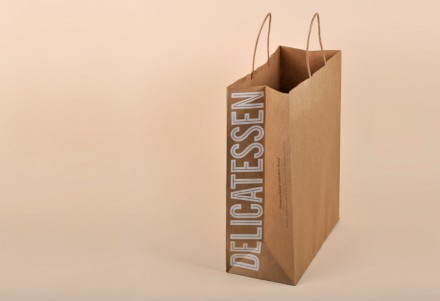
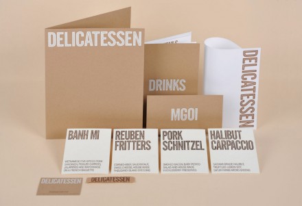
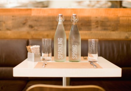
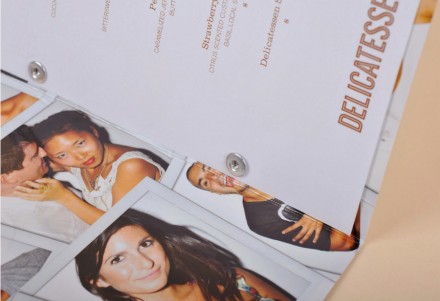
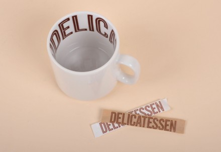
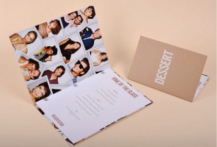
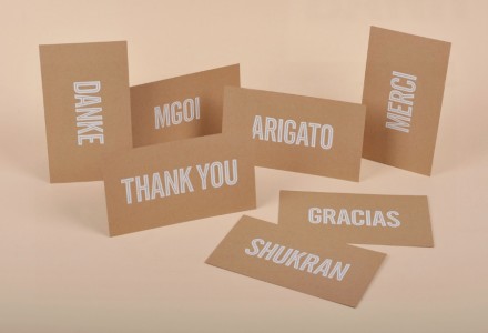
This world-influenced Deli was branded by the people over at Marque. Delicatessen is located in NYC where delis are a dime a dozen. This one stands out from that sea of delis with a unique brand identity that jumps out at passersby. The image is clean and organized which is a departure from what delis are like up there. Strong typography and imagery collide in this identity to give it the personality it needs to be alive.
Here’s what Marque says on their site:
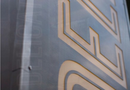
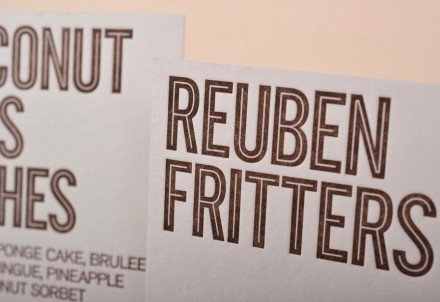
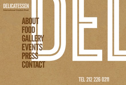
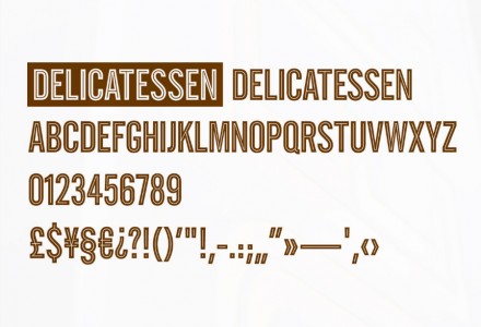
A spin on traditional comfort food from around the world was the inspiration behind Marque’s branding for Delicatessen at the crossroads of SoHo and Nolita – taking a contemporary position on the traditional delicatessen’s of New York. The typeface, a modern interpretation of the neon signage that is a prevalent feature on most of the city’s deli facades, was created specifically by German typographer Hubert Jocham and developed into a full character set for use across all materials. Materials and specifications were also chosen that had the inherent crafted qualities and detailing of traditional delicatessens, yet set in a contemporary world.




One Response