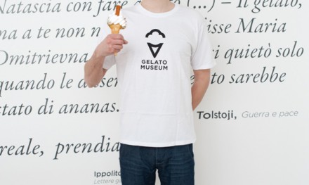
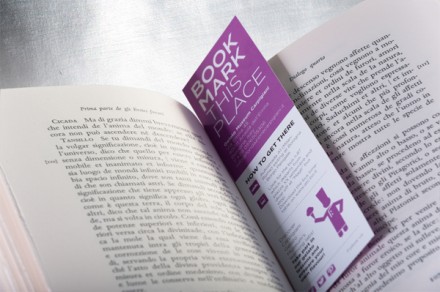
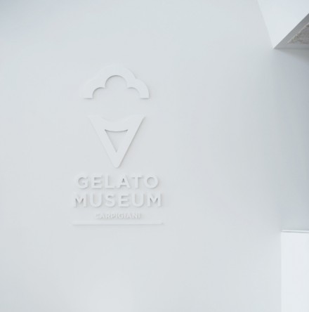
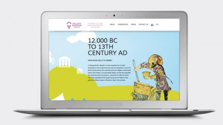
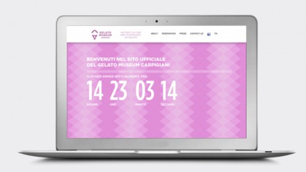
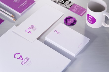
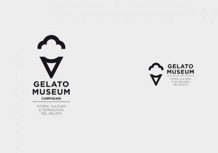
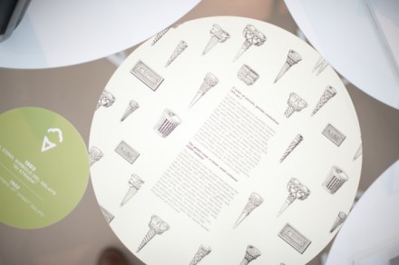
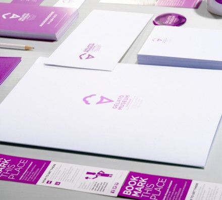
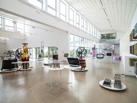
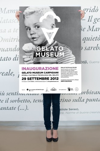
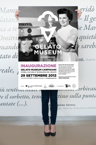
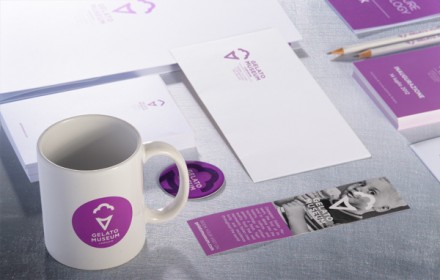
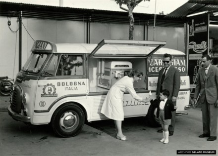
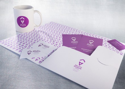
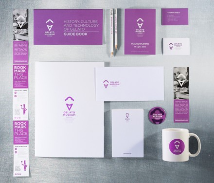
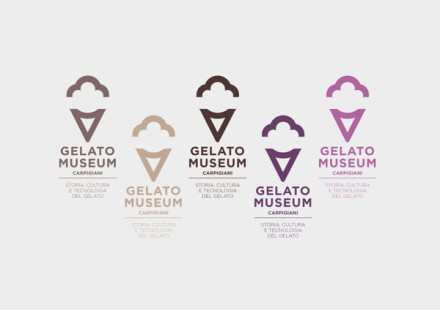
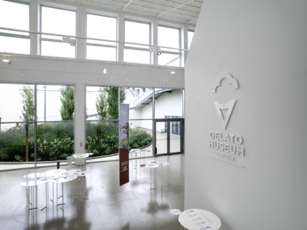
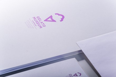
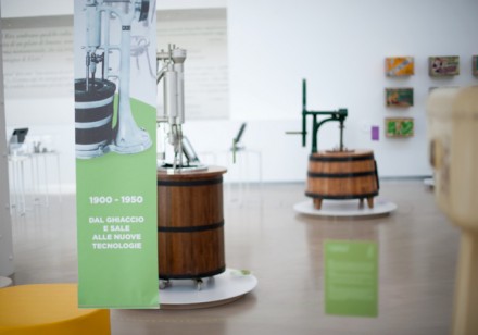
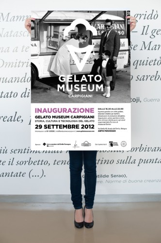
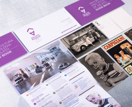
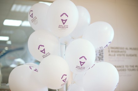
On the surface, the thought of branding a museum seems like a major challenge. Considering the past and the future of the museum’s focus could be endless, yet completely appropriate. But if you think about, isn’t that what you’re doing with every brand that you innovate, create or assimilate? Think about it; each brand that is successful is built to embrace aspects of the past while keeping an eye on the future. A brand needs to remain nimble as it charters each new day and step in its lifetime. If it can’t adapt to changing times, it fails. When brands can’t adapt and fail, they cease to exist or rebranding occurs. Each successful brand needs some element of timelessness to help it last. If it’s a fad, it’s doomed for a short shelf life. These are the kinds of things that Bipiuci considered when branding Italy’s Carpigiana Gelato Museum. The logo for the museum is simple, but very modern and sleek. That’s one example of the timeless quality they tried to evoke in the branding. There’s a lot of white in the scheme with a soft purple for an accent. The frame of the brand is also quite modern and a bit institutional. I appreciate that vibe because, despite the topic, museums are still supposed to educate first and foremost. The entire branding is still smart and clever (see the women’s restroom signage) and that’s just peachy (my personal favorite), but what they’ve created is a backdrop to a beautiful museum dedicated to the best snack ever.

