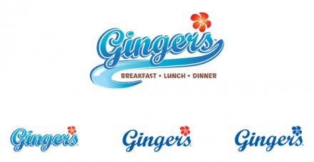
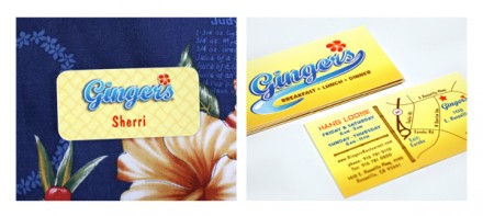
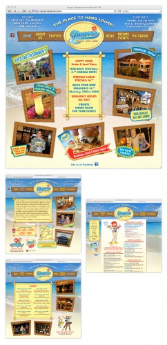
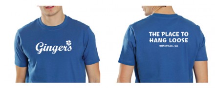
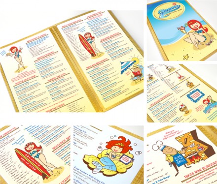
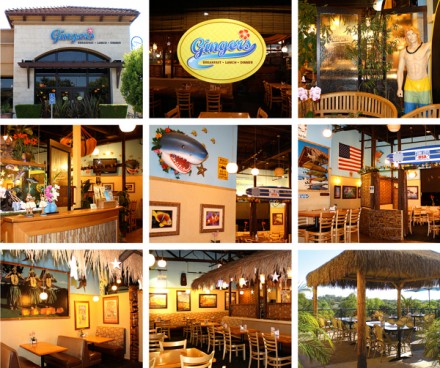
Ultimately your brand is what you want to project to your potential customers. It’s the vibe you anticipate them feeling when engaging with your brand. Some brands are flashy and modern and some are more subdued and throwbacks to a different time. In the world of branding it’s whatever works for the customer and typically that decision is driven by the potential customers of the brand. Ginger’s restaurant, by Jeannine Gaubert Pamoukdjian, seems to be exactly what the establishment wants and it’s a fitting brand construction for their offering. It’s a restaurant serving all three meals with a beach theme, suitable for a vacation-style spot near the coast in California. It starts with the logo, a wavy, aquamarine job in a cursive script with a flower tucked into the spot where the apostrophe would normally be. It’s not the most design-forward look I’ve ever seen, but it fits well with what they’re doing. It must have worked as well because the restaurant is routinely considered one of the best “casual” locations in the area. The complete brand follows with the fun and family feel with dancing characters, sand and all things beach. It’s not the kind of place that would draw me in personally (unless I had my parents in tow), but I like how Pamoukdjian seems to have stuck with what Ginger’s ownership wanted and gave them a brand reflective of what they represent.
The Forktales Podcast™: Interviews with restaurant industry leaders and visionaries
Restaurant and advertising industry headlines and thinking
Reviews of restaurant experiences from around the globe
Reviews of our favorite design, business, & restaurant books
Our favorite typography and fonts
Inspiration in your inbox
Get the latest inspiration in your inbox every Monday morning, for FREE!
"*" indicates required fields

