Branding Meets Perception

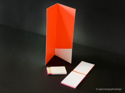
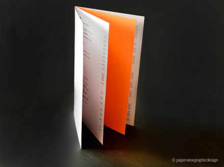
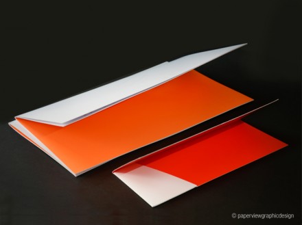
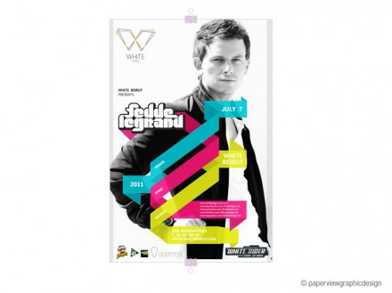
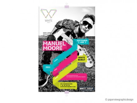
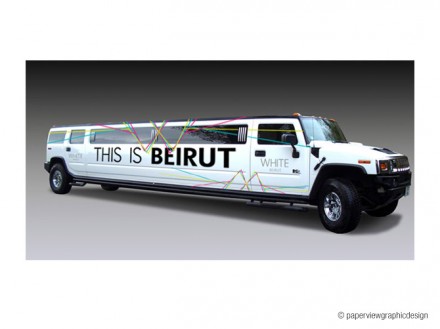
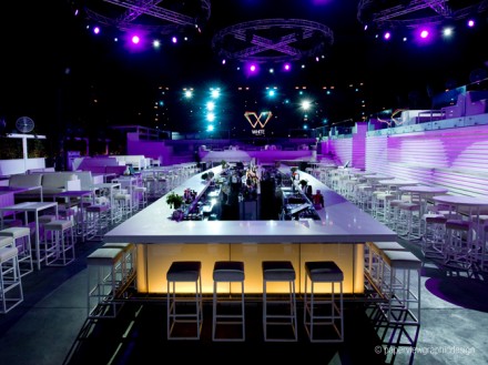
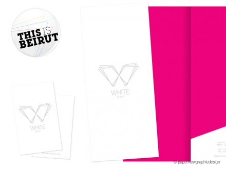
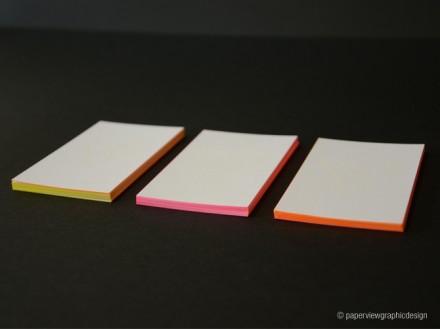
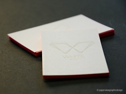
Sometimes branding a bar is license to be as extreme as imaginable. Paperview and White Beirut, a high-profile restaurant and lounge in Beirut, didn’t want to go over the top in their rebranding of the club, but they did want to make a statement. The statements they were looking for were “stylish”, “elitist”, “striking” and “slightly futuristic”. They landed there with a branding scheme designed around white and a few neon colors. The logo itself has good motion to it and features three eye-grabbing colors to make up the W. All the marketing collateral produced for White revolves around those three distinctive colors as well as the interiors of the bar itself, headlined by neon purple. White is one of the biggest and most popular clubs in Beirut, and the branding is on par with its attitude and perception.

WHITE-LOGO

billholder-BC

MENU

MENU-BILLHOLDER_11

poster1

poster2

WHITE HUMMBER BRANDING

WHITE-5

WHITE-ID


BC

BC2


Discuss this Project

Leave a Reply

This site uses Akismet to reduce spam. Learn how your comment data is processed.

The Forktales Podcast™: Interviews with restaurant industry leaders and visionaries

Restaurant and advertising industry headlines and thinking

Reviews of restaurant experiences from around the globe 

Reviews of our favorite design, business, & restaurant books

Our favorite typography and fonts

Inspiration in your inbox

Get the latest inspiration in your inbox every Monday morning, for FREE!

"*" indicates required fields

This field is for validation purposes and should be left unchanged.

Delicious Bits in your Inbox!

Get the latest and greatest content delivered to your inbox for free!

"*" indicates required fields

This field is for validation purposes and should be left unchanged.