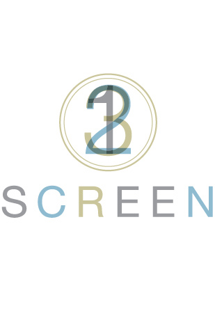
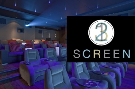
The movie theater Screen is part of a three-part experience at Chicago’s boutique hotel, The Wit. It works in a trio with the hotel’s three restaurants and full-service spa along with the location’s rooms. Three is part of a theme of the unified brand vibe of The Wit and its offerings and it shows up in the logo of the Screen. I really like what Boy Burns Barn created for Screen, specifically their logo. There are only a few movie theater brands in this country and they all have a certain look, a welcoming-enough appearance, but it’s primarily rooted in fantasy, bright lights and larger-than-life appearances. Screen has a posh appearance, perfectly suitable for its location. The logo’s centerpiece is a 3-2-1 image that has a transparent quality. It’s intended to mimic the old-school 3-2-1 countdowns on film reel movies and it does just that. I love how the logo references that, but isn’t nostalgic for that time period. It’s simply a reference and a jumping-off point for the brand. The logo draws in the eye and it captures the imagination. That’s what it’s all about.