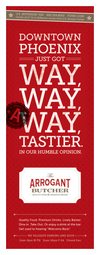
I found this lovely specimen on DesignWorkLife blog. Great branding campaign for the restaurant Arrogant Butcher. The strong deep and vibrant reds really pop on the monochromatic grays. The print work is coupled with some great apparel and signage to create this great brand experience.
Designed by Tunnel Bravo


2 Responses
Thanks for the nice feature on our work.
It’s flattering to have someone with so much restaurant experience get excited about the brand.
We’re looking forward to getting Fire It Up and using it to help on future projects.
Hey guys! No problem! The work is awesome and well done. Obviously thought through from soup to nuts and definitely worth showcasing. Please feel free to contact me with your thoughts on FIRE IT UP! Honored to have you read it!