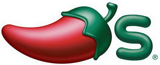
Chili’s, mostly known for run of the mill tex-mex style food has updated its brand once again. Originally it featured a custom typeface that flowed together in an interesting manner. It evolved into a creepy, plastic looking 3-D rendering of a chili, and now the name itself has been dropped completely. Chili’s is now 75% visual with an “‘s” accompaniment. This plays directly into how we, as humans, interpret logos (graphic > color > word). Tesser, who spearheaded the design has this brief case study:
Increased profits and Texas-size growth are the key to success for this iconic global brand. The time though had come for the Chili’s identity and store design to become more grown-up too. Tesser was called in to recreate their identity and remodel the Chili stores. Tesser blended their authentic Texas roots with contemporary adult appeal, and a less cartoony feel. The revitalized brand is capturing new customers while re-engaging their existing fans to visit more often.
Old, 3-D logo:
Classic Chili’s logo:
Renderings from the Tesser website:


