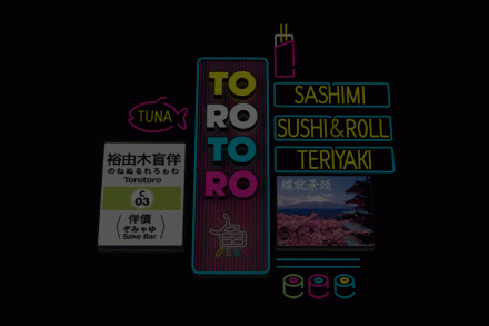
The design team at Savvy pushed the boundaries with this sushi and sake bar branding. Instead of an expected play on Japanese colors and fish iconography, they went completely modern. It’s clean. It’s fun. The typography is excellent and the way it plays out through the other brand touch points is excellent.


