A Trustworthy Branding For Cup To Cup

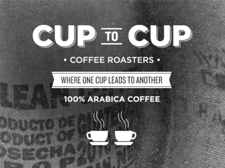
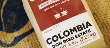
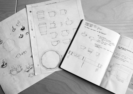
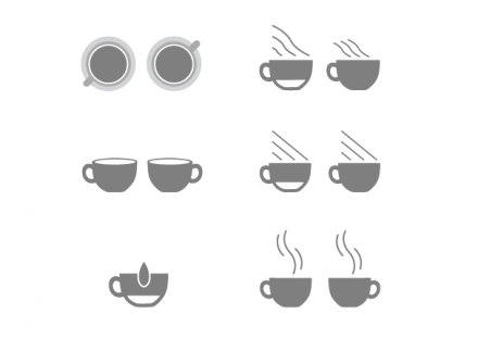
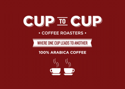
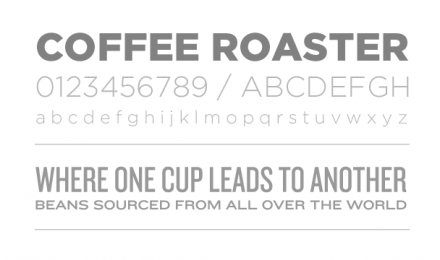
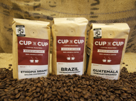
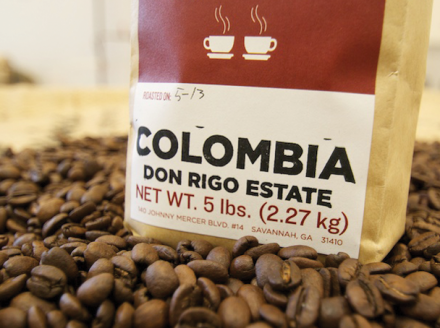
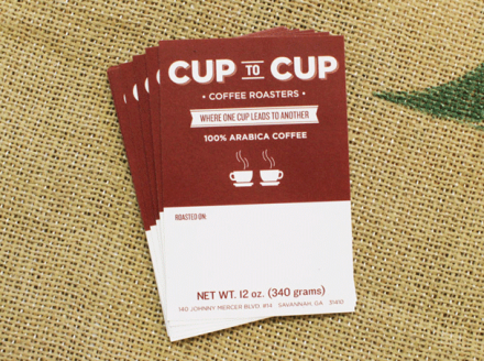
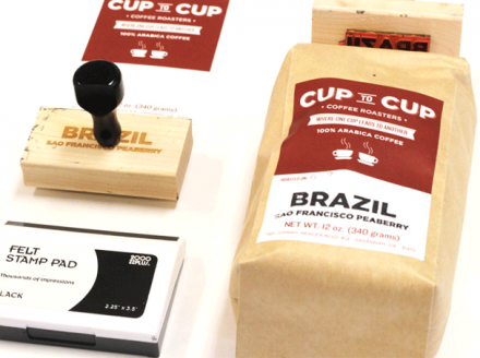
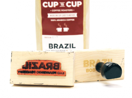
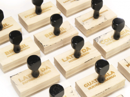
Cup to Cup isn’t a coffee shop, instead a coffee roaster competing in the very competitive specialty coffee market around the world. Focus Labs wanted to help Cup to Cup preserve its exiting brand identity while giving it a face lift of sorts to accentuate quality and the trustworthiness that Cup to Cup seeks to present as they try to win  new customers. Using a dominant font style to work with a traditionally-designed logo, Cup to Cup is given a polished appeal while maintaining their community roots. Focus Labs also helped out with a new means to stamp Cup to Cup’s coffee bags, replacing an old and less-efficient method.

cup_to_cup_14

cup_to_cup_1

cup_to_cup_2

cup_to_cup_3

cup_to_cup_5

cup_to_cup_6

cup_to_cup_7

cup_to_cup_8

cup_to_cup_9

cup_to_cup_10

cup_to_cup_11

cup_to_cup_12

Discuss this Project

Leave a Reply

This site uses Akismet to reduce spam. Learn how your comment data is processed.

The Forktales Podcast™: Interviews with restaurant industry leaders and visionaries

Restaurant and advertising industry headlines and thinking

Reviews of restaurant experiences from around the globe 

Reviews of our favorite design, business, & restaurant books

Our favorite typography and fonts

Inspiration in your inbox

Get the latest inspiration in your inbox every Monday morning, for FREE!

"*" indicates required fields

This field is for validation purposes and should be left unchanged.

Delicious Bits in your Inbox!

Get the latest and greatest content delivered to your inbox for free!

"*" indicates required fields

This field is for validation purposes and should be left unchanged.