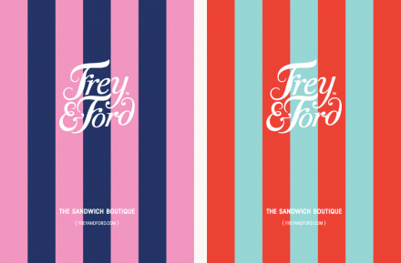
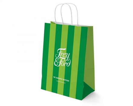
You can make a sandwich with a lot of different ingredients, but generally, a sandwich isn’t a very complicated assembly. Hong Kong’s Frey & Ford embrace the simplicity of their product, but allowed designer Daniel Freytag to add touches to the Frey & Ford brand that implied exclusivity. First, there’s the use of “boutique” in the shop’s description. While the term may be overused a bit, it still has certain implications and Frey & Ford use that to their advantage. The result is a little sarcastic, but establishes Frey & Ford as something more than your average sandwich joint. In much of the marketing materials, including the take-out bags, Freytag gave Frey & Ford a striped look that brings to mind numerous clothing boutiques that use their bags as a major marketing tool. Frey & Ford may offer a quality and simple product, but their branding materials imply special and that’s what any brand is looking for.