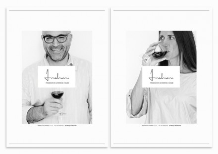
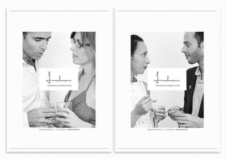
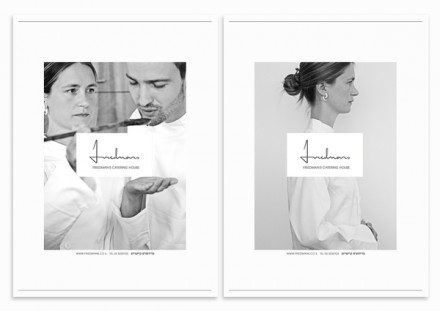
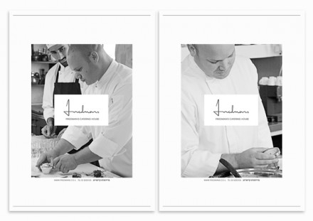
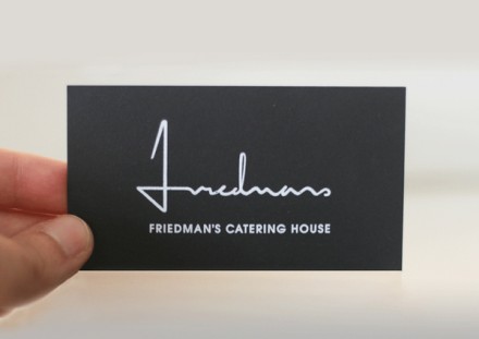
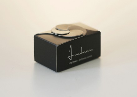
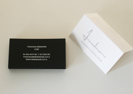
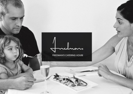
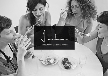
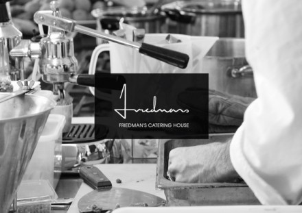
A catering company needs to first deliver good food and be easy to work with. If you can’t do that, your longevity in the highly competitive industry will be nonexistent. The branding that Israel’s Koniak Design gave Friedman’s Catering definitely gives the impression they can’t delivery those two basics at a minimum. What they’ve given Friendman’s is a branding presence that says quality and fun. It’s also a branding strategy that is consistent with the pillars of the Friedman’s company, a few of which are: be bold, collaborate and have fun. The use of the images of different settings and people behind the Friedman’s logo implies a universal ability to work with all types of people, events and food styles, a must for a good caterer. There’s a classy element to all of Koniak’s work for Friedman’s as well, influenced from the well-dressed and presented people in the images as well as the black and white color scheme.

948121237715748

948121237715672

948121237715681

948121237715694

948121237715703

948121237715715

948121237715727

948121237715741


948121237715632

948121237715646

948121237715657


Discuss this Project

Leave a Reply

This site uses Akismet to reduce spam. Learn how your comment data is processed.

The Forktales Podcast™: Interviews with restaurant industry leaders and visionaries

Restaurant and advertising industry headlines and thinking

Reviews of restaurant experiences from around the globe 

Reviews of our favorite design, business, & restaurant books

Our favorite typography and fonts

Inspiration in your inbox

Get the latest inspiration in your inbox every Monday morning, for FREE!

"*" indicates required fields

This field is for validation purposes and should be left unchanged.

Delicious Bits in your Inbox!

Get the latest and greatest content delivered to your inbox for free!

"*" indicates required fields

This field is for validation purposes and should be left unchanged.