Community-Focused Identity For Maine’s Farmers Fare

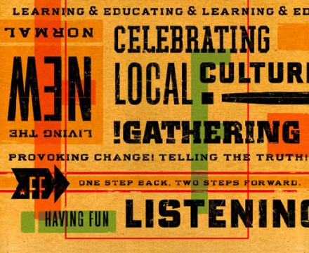
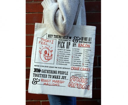
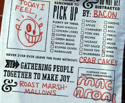
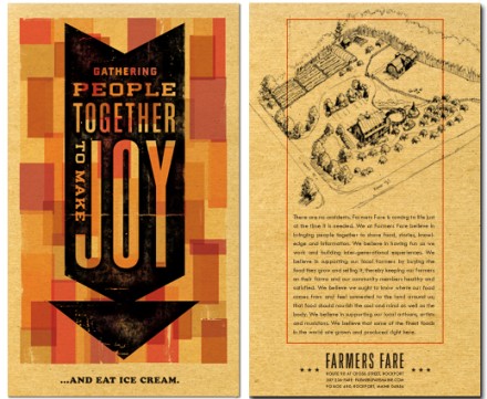
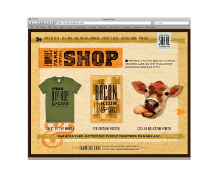
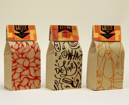
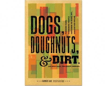
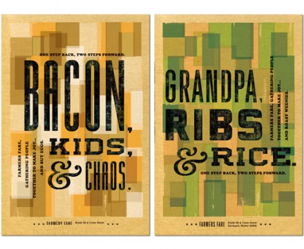
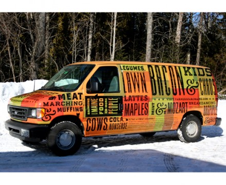
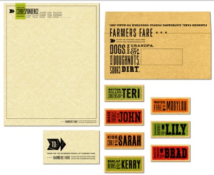
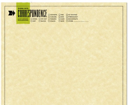
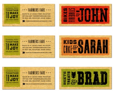
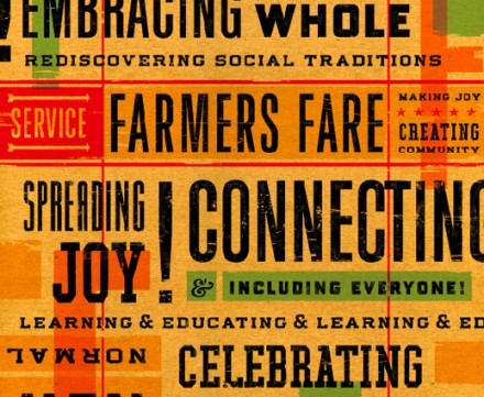
Farmers Fare is a Maine-located market and community space selling goods and products grown and made in Maine. They asked Helms Workshop to help with the branding identity of their location, but it’s a little different from traditional restaurant branding, which makes sense because Farmers Fare isn’t your typical restaurant or grocery store. Farmers Fare wanted an identity that embraced community and not just a place where people go to buy produce. Helms Workshop used highly graphic elements in the branding material, focusing on key words that point to the message of Farmers Fare. Helms created interactive bags and placemats for the cafe that call on guests to write in responses Mad Libs style. The resulting branding gives Farmers Fare a unique presentation to its community, taking the age-old concept of a community grocery selling local and giving it a hip, fun and modern appeal.

PF_FFARE1_8

PF_FFARE1_9

PF_FFARE1_10

PF_FFARE1_11

PF_FFARE1_12 PF_FFARE1_13 PF_FFARE1_14

PF_FFARE1_1 PF_FFARE1_2 PF_FFARE1_3 PF_FFARE1_4 PF_FFARE1_5 PF_FFARE1_6 PF_FFARE1_7

Discuss this Project

Leave a Reply

This site uses Akismet to reduce spam. Learn how your comment data is processed.

The Forktales Podcast™: Interviews with restaurant industry leaders and visionaries

Restaurant and advertising industry headlines and thinking

Reviews of restaurant experiences from around the globe 

Reviews of our favorite design, business, & restaurant books

Our favorite typography and fonts

Inspiration in your inbox

Get the latest inspiration in your inbox every Monday morning, for FREE!

"*" indicates required fields

This field is for validation purposes and should be left unchanged.

Delicious Bits in your Inbox!

Get the latest and greatest content delivered to your inbox for free!

"*" indicates required fields

This field is for validation purposes and should be left unchanged.