An Italian American Branding Effort With A Punch

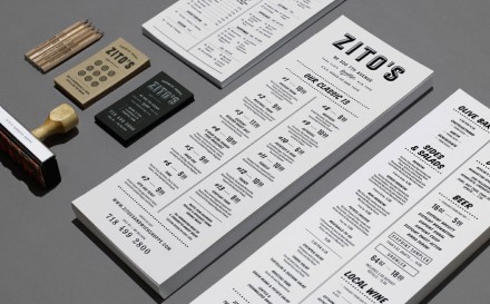
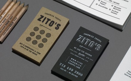
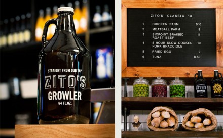
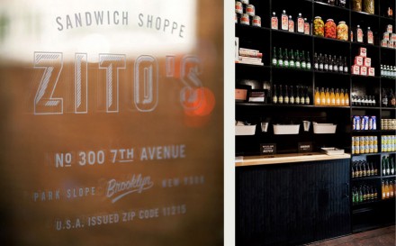
Zito’s makes sandwiches. They’re about as traditional Italian American as it comes and they’re packed with ingredients and flavor. They’re the kind of sandwiches a neighborhood comes to love and take pride in. They’re the kind of sandwiches that define a heritage. Those are the kind of ideas Zito’s had when they opened their first Brooklyn shop and Tag Collective helped them shape a brand identity to match. The logo itself is strapping, a strong representation of what Zito’s represents: a place with a backbone, but one kind of like that crazy uncle that isn’t afraid to let his hair down and have some fun. The brand works well because it hits home on the heritage portion of the shop and keeps everything else about the design relatively simple and clean. Not a lot of fluff from Zito’s, what is expected from a Park Slop sandwich shop, but fresh enough to know they still care about the quality of everything they do.

tagcollective-mrcup-16

tagcollective-mrcup-17

tagcollective-mrcup-18

tagcollective-mrcup-19

tagcollective-mrcup-20

Discuss this Project

Leave a Reply

This site uses Akismet to reduce spam. Learn how your comment data is processed.

The Forktales Podcast™: Interviews with restaurant industry leaders and visionaries

Restaurant and advertising industry headlines and thinking

Reviews of restaurant experiences from around the globe 

Reviews of our favorite design, business, & restaurant books

Our favorite typography and fonts

Inspiration in your inbox

Get the latest inspiration in your inbox every Monday morning, for FREE!

"*" indicates required fields

This field is for validation purposes and should be left unchanged.

Delicious Bits in your Inbox!

Get the latest and greatest content delivered to your inbox for free!

"*" indicates required fields

This field is for validation purposes and should be left unchanged.