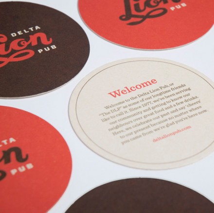
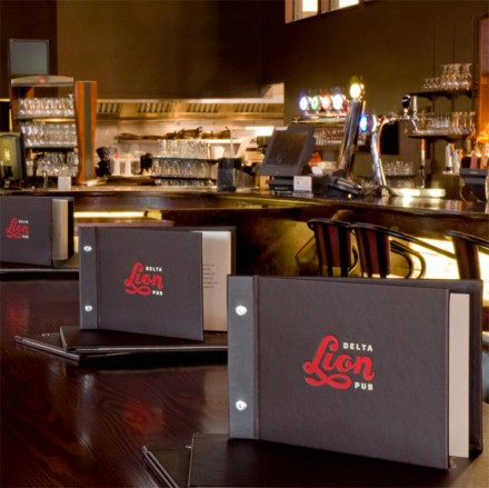
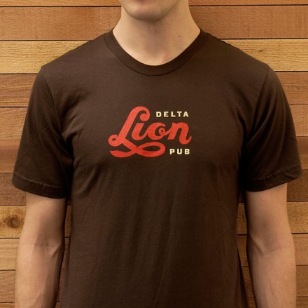
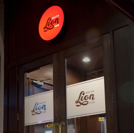
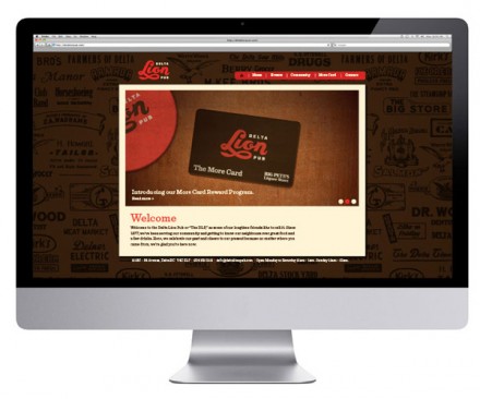
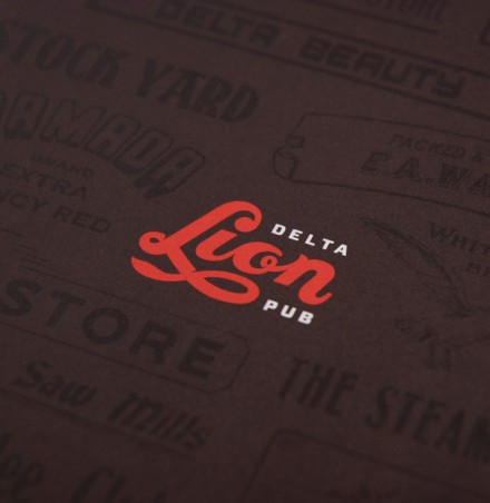
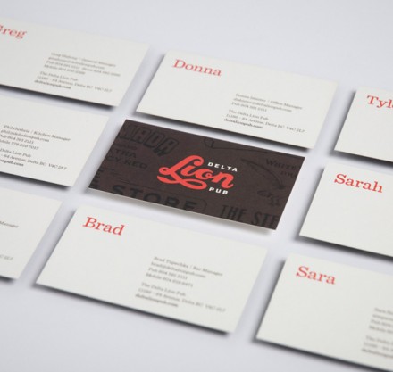
The Delta Lion pub in British Columbia starts its branding identity with a clever logo, designed by St. Bernadine, that immediately brings to mind the old baseball logos of the early years of the sport. With retro elements and a red and brown color palate, the logo hits home and is the first starting place for a bar that specializes in being welcoming. The old television show Cheers may not mean much to Canadians, but if it did, they’d say it reminded them of the Delta Lion. It’s a place that calls their customers “neighbors” and community is everything. These details are captured well in the execution of the logo and trickle down into the interior elements, highlighted by large tables and wood everything.

delta-lion-pub-00


delta-lion-pub-03

delta-lion-pub-04

delta-lion-pub-05

delta-lion-pub-06

delta-lion-pub-07

delta-lion-pub-08

delta-lion-pub-09


delta-lion-pub-01

delta-lion-pub-02


Discuss this Project

Leave a Reply

This site uses Akismet to reduce spam. Learn how your comment data is processed.

The Forktales Podcast™: Interviews with restaurant industry leaders and visionaries

Restaurant and advertising industry headlines and thinking

Reviews of restaurant experiences from around the globe 

Reviews of our favorite design, business, & restaurant books

Our favorite typography and fonts

Inspiration in your inbox

Get the latest inspiration in your inbox every Monday morning, for FREE!

"*" indicates required fields

This field is for validation purposes and should be left unchanged.

Delicious Bits in your Inbox!

Get the latest and greatest content delivered to your inbox for free!

"*" indicates required fields

This field is for validation purposes and should be left unchanged.