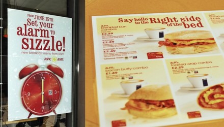
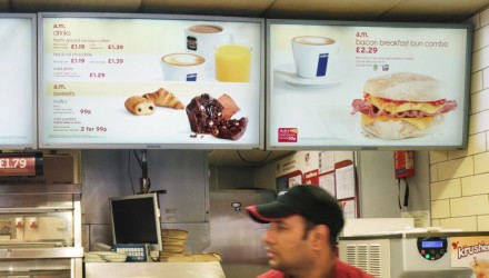
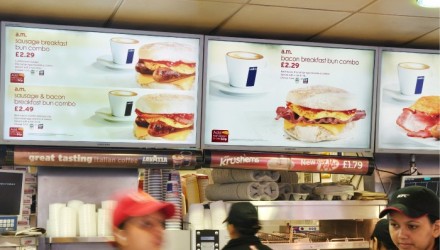
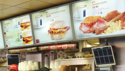
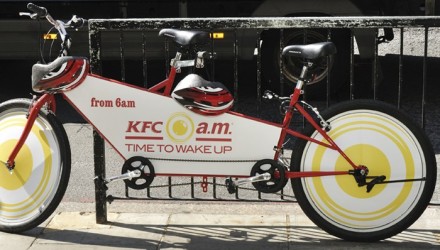
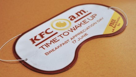
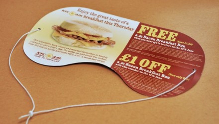
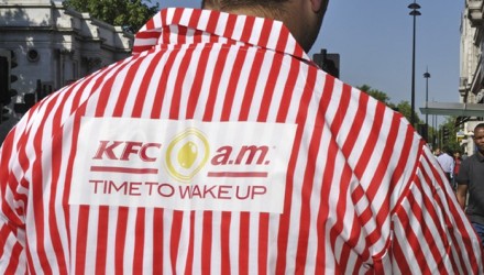
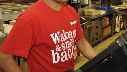
Brands test products all the time, but they don’t always promote them like they should. Design Bridge helped KFC test their breakfast concepts in the UK and the first step was to determine a number of different ways to deliver the message. There are the typical store posters and menu board designs, but Design Bridge gave KFC some pretty clever ideas as well. They introduced bike signage, a less-mobile version of the popular bus wrap, t-shirts and even sleeping masks. The masks were a clever twist on the overall concept: waking up and starting your day with KFC. The campaign is filled with images of the food, often quite large and serves to give the potential consumer something to consider. The concept launches from KFC’s “Real Food, Real Taste” traditions and doesn’t stray far from what KFC is building. It’s a clever marketing strategy to profile a potential big winner for the company without compromising the groundwork they’ve already put down.
The Forktales Podcast™: Interviews with restaurant industry leaders and visionaries
Restaurant and advertising industry headlines and thinking
Reviews of restaurant experiences from around the globe
Reviews of our favorite design, business, & restaurant books
Our favorite typography and fonts
Inspiration in your inbox
Get the latest inspiration in your inbox every Monday morning, for FREE!
"*" indicates required fields

