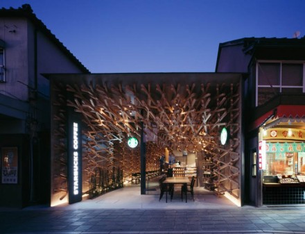
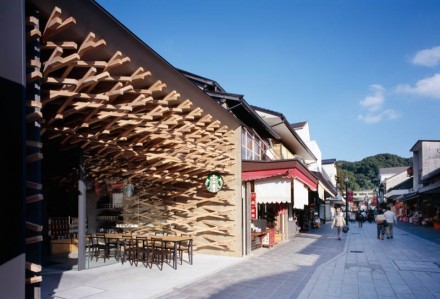
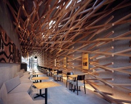
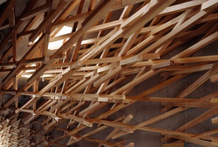
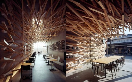
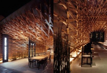
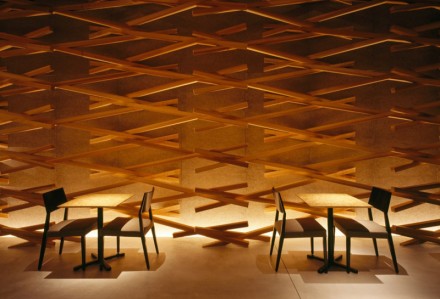
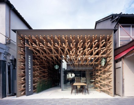
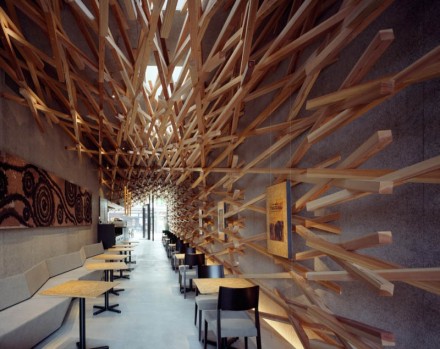
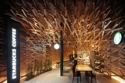
Starbucks has always done a nice job with all aspects of their branding. Everything from their logo to the design of their stores is considered carefully. World-renowned architect Kengo Kuma designed the Starbucks at Dazaifu Tenmangu, a Japanese shrine that receives around 2 million visitors each year. Kuma used one major architectural feature to make this Starbucks memorable, yet fit with its surroundings. Using weaving sticks, Kuma gave the shop an artistic touch that is as compelling as many of the historical buildings it surrounds. The weaving sticks follow you through the narrow building, giving the location a sense of escape, or a cave, as Kuma described it. Incidentally, standing outside of this building looking in, the view of the store as the sticks protrude out isn’t that unlike the container of stir sticks that every store in the world has at the condiment bar.
The Forktales Podcast™: Interviews with restaurant industry leaders and visionaries
Restaurant and advertising industry headlines and thinking
Reviews of restaurant experiences from around the globe
Reviews of our favorite design, business, & restaurant books
Our favorite typography and fonts
Inspiration in your inbox
Get the latest inspiration in your inbox every Monday morning, for FREE!
"*" indicates required fields

