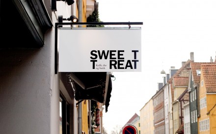
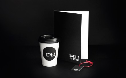
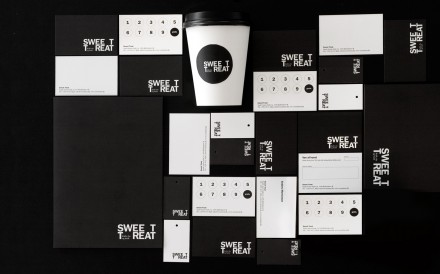
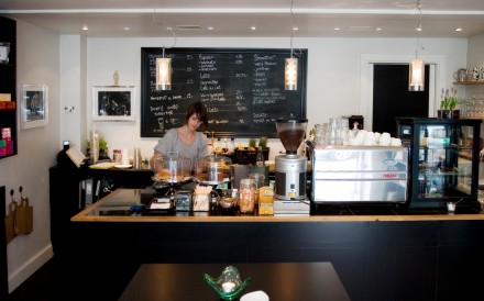
Often the less is more mantra of many designers can lead them astray. With re-public’s identity design of coffee shop Sweet Treat, they managed to stay on track with less is more. Using an understated black and white design, Sweet Treat offers a minimalist design that revolves around a curious issue of spacing in the logo itself. Re-public says the break in print is intended to mirror the break from the hustle and bustle of life that the shop offers to its guests. The result is a simple logo to accompany a shop that isn’t focused on the frills, but instead a shop designed to give customers a tasteful diversion as they go about life.
The Forktales Podcast™: Interviews with restaurant industry leaders and visionaries
Restaurant and advertising industry headlines and thinking
Reviews of restaurant experiences from around the globe
Reviews of our favorite design, business, & restaurant books
Our favorite typography and fonts
Inspiration in your inbox
Get the latest inspiration in your inbox every Monday morning, for FREE!
"*" indicates required fields

