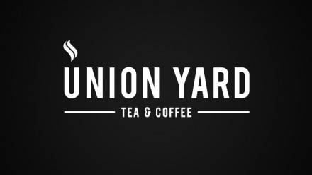
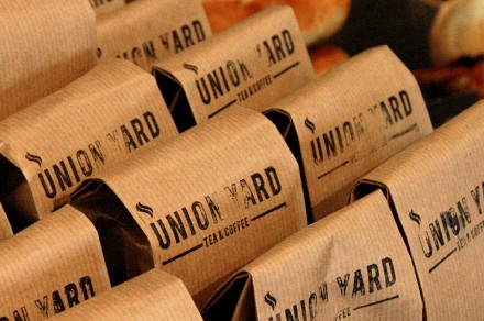
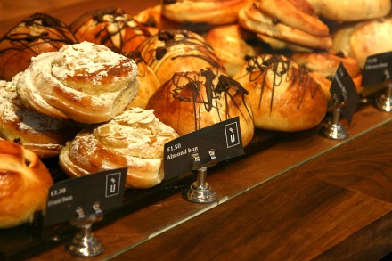
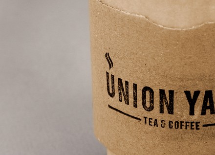
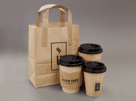
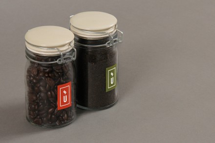
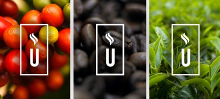
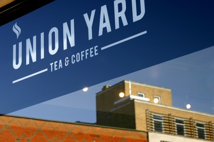
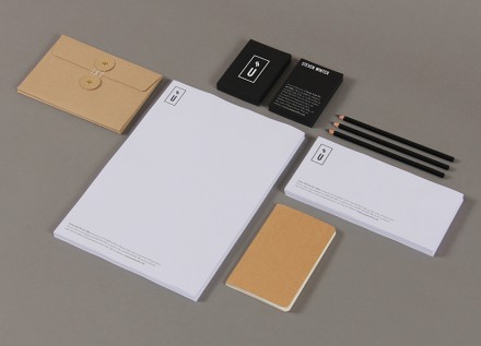
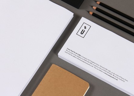
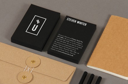
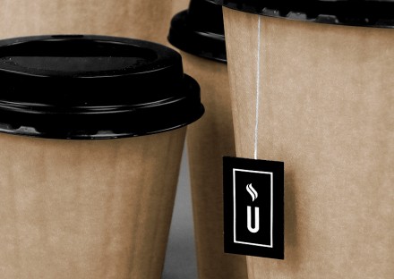
While at The Click UK designer Matthew Hancock directed the branding for Union Yard Tea & Coffee and pinpointed the steaming U in “Union Yard” to serve as the center of the branding efforts. It also is convenient, giving Union Yard a logo that can be reproduced and used (with a rubber stamp) in a variety of ways. Set in a bold face, the typography speaks directly and the steaming U can also stand on its own, serving as the single image that links consumer’s minds back to the Union Yard Tea & Coffee brand. The central logo appears on bags, coffee sleeves and tea bags and the use of cardboard and the natural colors of it lend a rustic appeal to the coffee shop and brand. The interior of the shop is pretty simple and straight-forward, not unlike the brand. The use of the rubber stamp of the logo gives the brand a touch of a homemade, D.I.Y. ethic as well; something that likely resonates with Union Yard’s intended target.
