Soup & Co.’s Simple Branding Strategy

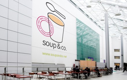
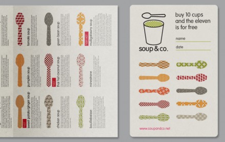
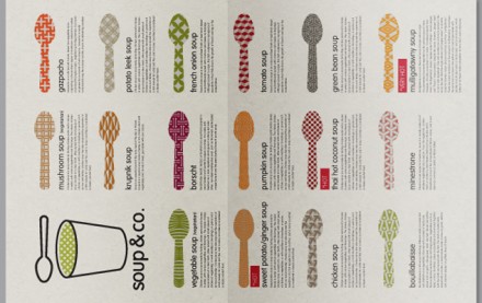
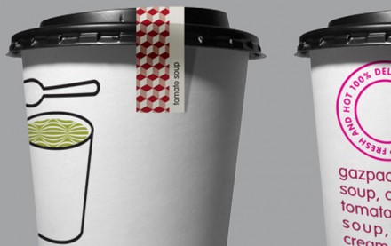
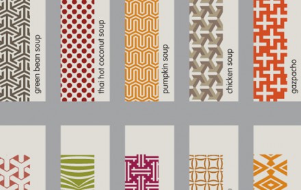
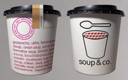
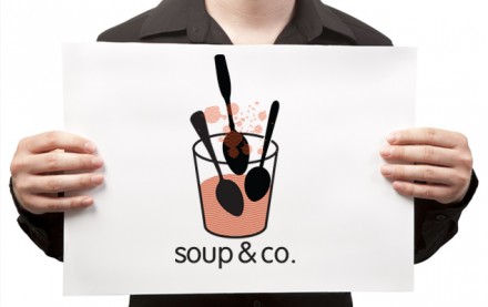
Soup & Co. makes soup in a cup and Blend It helped them brand their concept and develop their identity. Based out of Russia, Soup & Co. wanted to keep it simple and Blend It developed an easy-to-use and portable cup for the soup, but the key to the entire identity is the stickers used to seal the lid to the cup. Each sticker is patterned after one of the soup flavors so it makes the cup distinguishable and also adds further texture and color to the package. Pretty simple and effective branding and packaging for a soup company aiming to be simple.

03

04

05

06

07

08

02

Discuss this Project

Leave a Reply

This site uses Akismet to reduce spam. Learn how your comment data is processed.

The Forktales Podcast™: Interviews with restaurant industry leaders and visionaries

Restaurant and advertising industry headlines and thinking

Reviews of restaurant experiences from around the globe 

Reviews of our favorite design, business, & restaurant books

Our favorite typography and fonts

Inspiration in your inbox

Get the latest inspiration in your inbox every Monday morning, for FREE!

"*" indicates required fields

This field is for validation purposes and should be left unchanged.

Delicious Bits in your Inbox!

Get the latest and greatest content delivered to your inbox for free!

"*" indicates required fields

This field is for validation purposes and should be left unchanged.