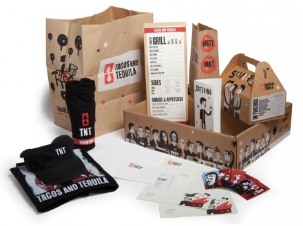
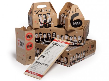
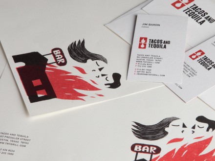
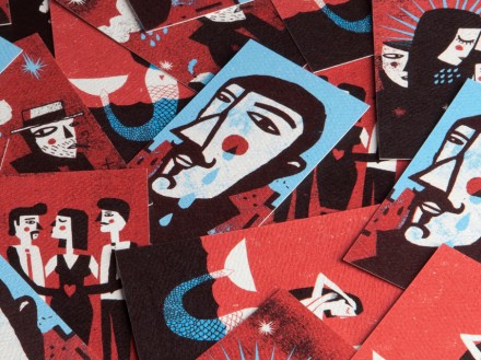
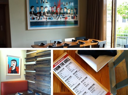
Sometimes the best branding comes from work that takes your mind elsewhere for just a moment. Brandon DeLoach created something memorable for Austin, Texas’ Tacos and Tequila and the success is in the details of the work. DeLoach chose to center much of the brand’s identity on illustrations from Cristóbal Schmal. There’s an abstract, Picasso-like quality to the illustrations and the variety of people involved and their poses make this branding effort quite fun to take in. The menus of T&T are pretty straight-forward, incorporating the popular rubber-band-and-a-piece-of-paper-as-the-menu trick, but it doesn’t need a lot of clout because the imagery found all over the brand otherwise carries everything. The work is memorable, thought-provoking and like things you’ve seen before, even if you can’t place it. Those are all great qualities of a strong brand and DeLoach imagined something fantastic for Tacos and Tequila.

