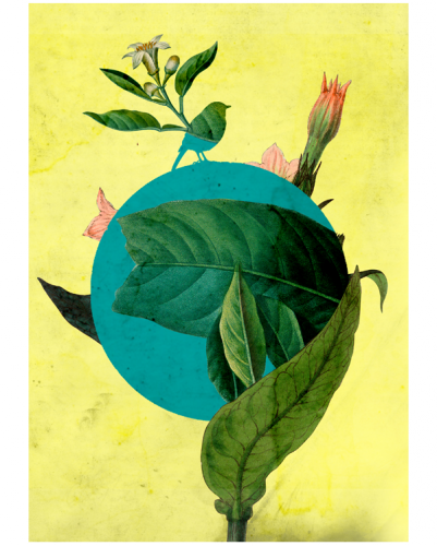
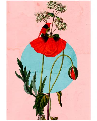
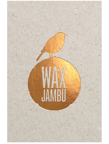
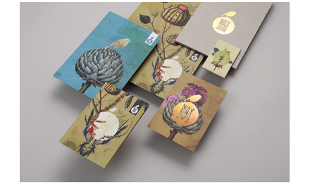
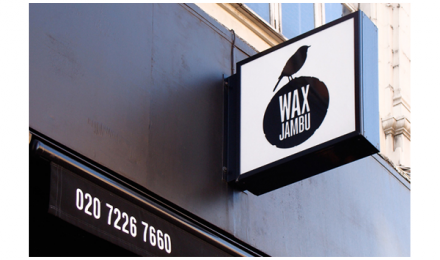
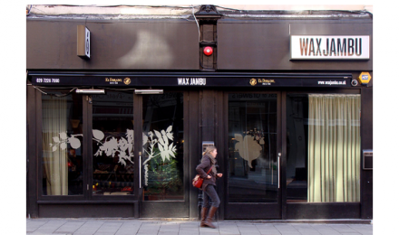
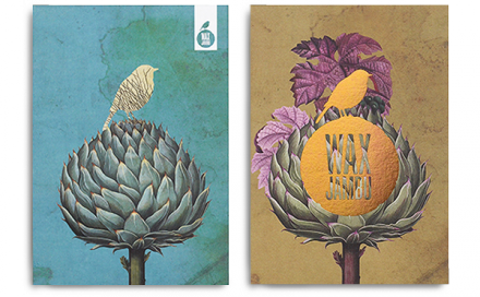
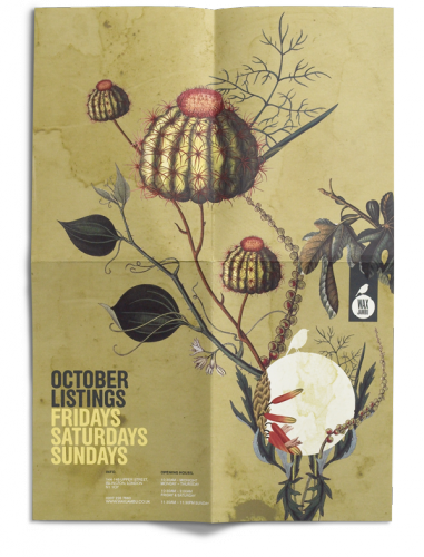
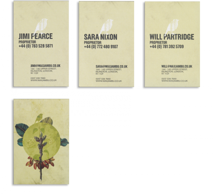
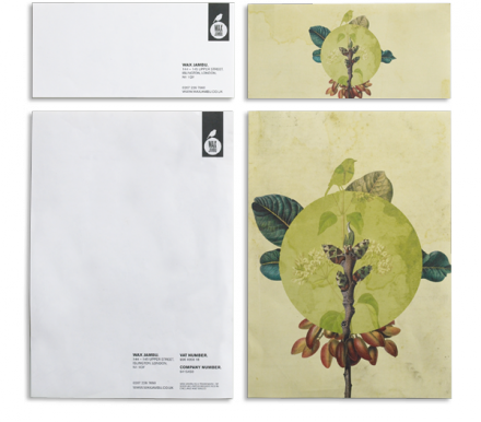
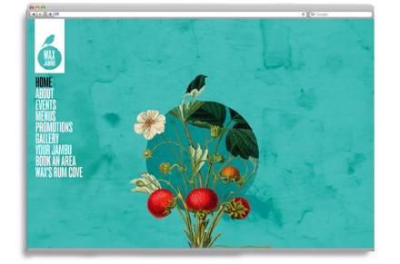
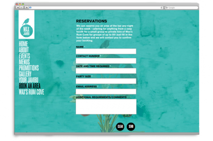
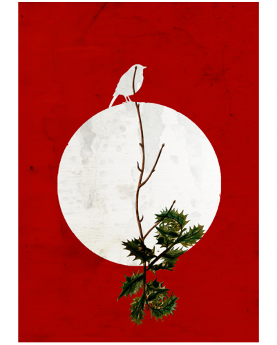
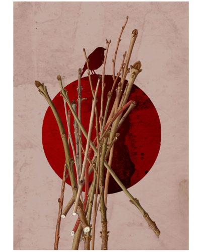
Most plans for bars and restaurants include an interior that is well defined and doesn’t really change or alter over time unless a major overhaul is included. Typically the branding that accompanies the concept mirrors the vibe of the interior. This is also the case with London’s boutique bar Wax Jambu, but with one major difference: the interiors change every few months. Aligned with the seasons of the year, Wax Jambu’s plan was to change everything four times a year. Studio Output used that fluidity to influence their branding work for the bar. The seasonal changes are meant to inspire customers to engage with the interiors and allow Wax Jambu to create a “lived in” and homey feel, a characteristic not often associated with bars. With the seasonal changes and the cozy vibe, Studio Output created a brand identity rooted in naturalistic drawings, botanical in nature, which looks like more like works of art than brand scheme. The drawings, and as an extension the entire brand, have a friendly feel and the centerpiece of the design is the logo featuring a bird. Much of the art involving the logo uses foil embossing that helps create a textured feel and the overall warmth of the identity matches what Wax Jambu creates inside its doors.
The Forktales Podcast™: Interviews with restaurant industry leaders and visionaries
Restaurant and advertising industry headlines and thinking
Reviews of restaurant experiences from around the globe
Reviews of our favorite design, business, & restaurant books
Our favorite typography and fonts
Inspiration in your inbox
Get the latest inspiration in your inbox every Monday morning, for FREE!
"*" indicates required fields

