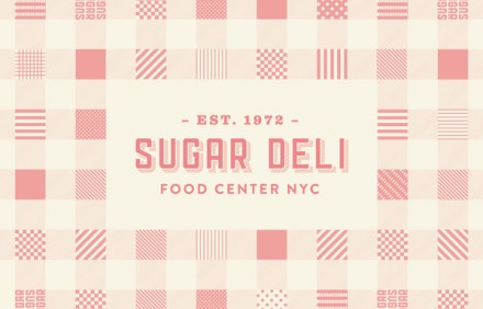
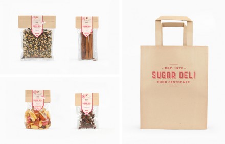
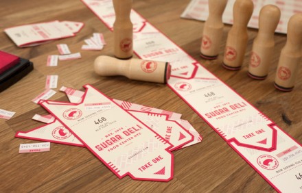
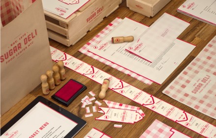
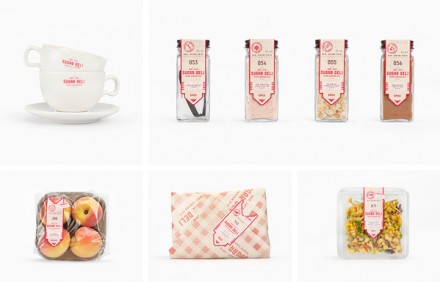
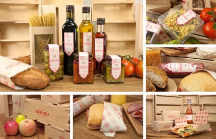
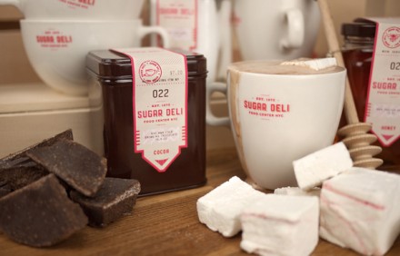
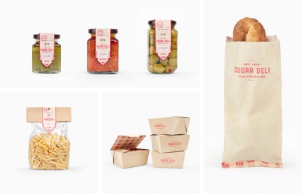
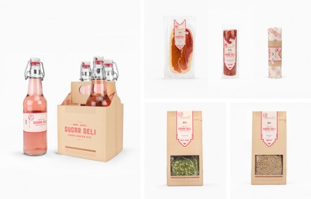
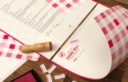
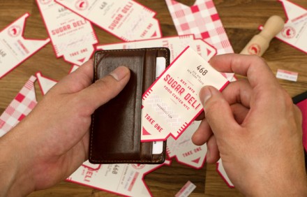
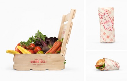
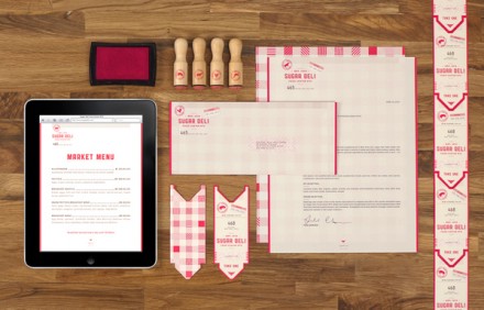
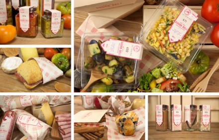
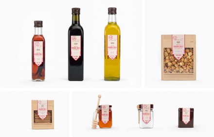
The gingham print is borderline iconic for its expression of what most people associate with picnics, summer, iced tea and a cool breeze. It has such an identity of its own that you rarely see it used in branding, but Fred Carriedo used it in his branding of New York’s Sugar Deli and he nailed it. The gingham pattern is the jumping point for Carriedo and he uses a variety of the prints to create one table setting, so to speak, for the primary logo. Using a soft red, Carriedo completes the branding with stamps and seals that resemble the line-number tickets you often get at the butcher. It’s a smart design and it works well with the colors chosen and the nostalgic, yet slightly contemporary, image of Sugar Deli.
