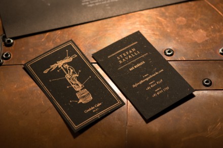
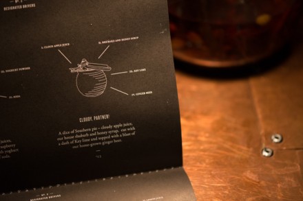
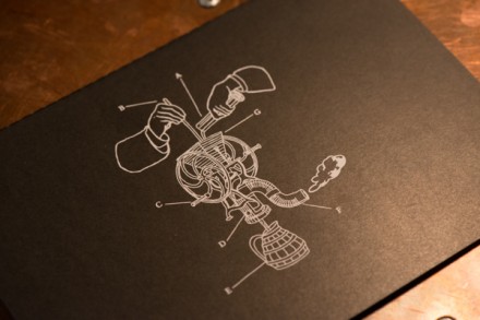
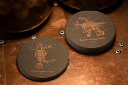
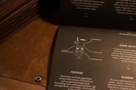
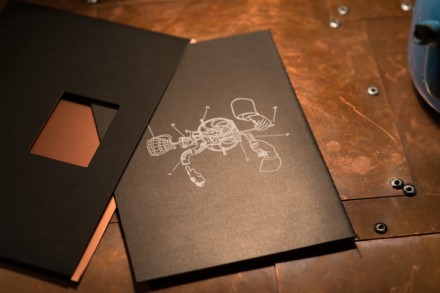
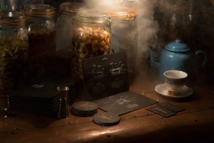
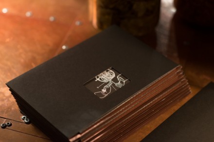
The Singapore bar, The Secret Bar, among other things, requires a password for entry. Some would call a trait like that a gimmick, but usually that term refers to something offering little value. In the world of restaurant branding, there aren’t really gimmicks, but rather quirks and characteristics that make a place stand out or memorable among the sea of good ideas and best intentions out there. The race for creativity in the restaurant game is not unlike the the nuclear arms race during The Cold War era. Everyone is trying to outdo the other with some clever quality that sets them apart. In the case of The Secret Bar, a branding effort by Foreign Policy, all the details that go into making the bar feel like, well, a secret work brilliantly. Some might say if your product is good enough, you don’t need an uber-creative scheme, but you can always counter that by saying a strong branding effort mixed with a strong food/drink/vibe effort is your best chance to survive. What Foreign Policy does with The Secret Bar is take all the aspects of the speakeasies in the United States during the early 1900s that provided people a place to drink while it was illegal during the Prohibition era. With hidden store fronts, password entry and offbeat products, The Secret Bar isn’t that unlike those speakeasies. Much of the print branding takes advantage of interesting-looking diagrams of stuff with fancy words and descriptions, implying secret documents that are undercover. Everything about The Secret Bar implies undercover and that’s the whole point. While they fly under the radar, they’ve captured the client that has the imagination to enjoy all aspects of what they’re serving.

