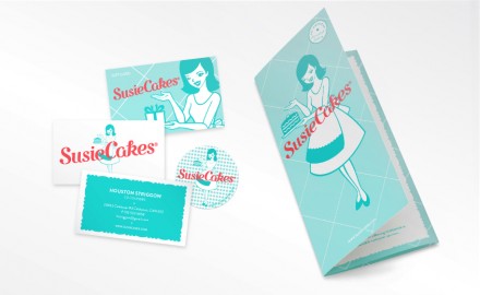
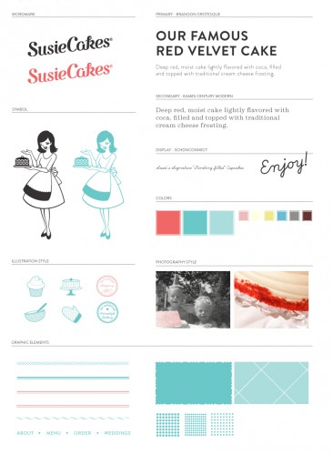
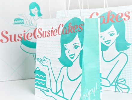
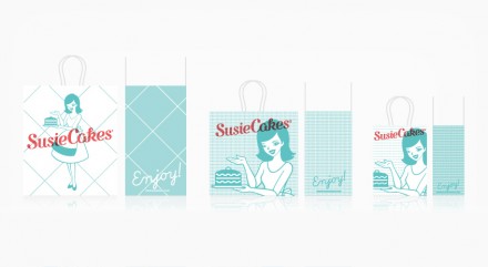
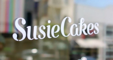
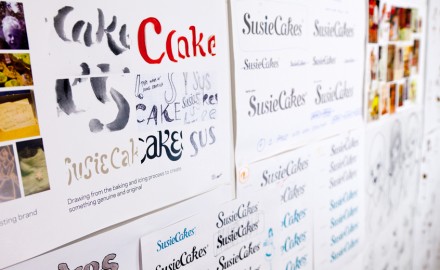
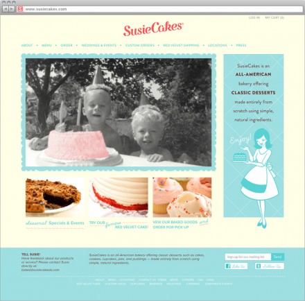
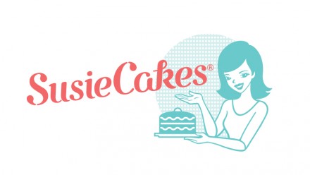
If you do something well in the world of food, the accompanying branding of your product should be somewhat easy. Essentially you’re highlighting what you do well and most brand creators use aspects like that as the jumping off point for a creative brand. Baker Susie Cakes has apparently the best red velvet cupcake in the world and the desire to expand the brand’s online presence with the capability to ship nationally led Susie Cakes to hire Red Antler to give her a little bit of a makeover. The branding started with the typeface used in Susie Cakes. Red Antler found inspiration in the forms made from the lettering of buttercream frosting on cakes and from there they handmade a typeface that resembles the traditional celebratory remarks on cakes. The tradition of Susie Cakes and the fresh-baked aspect of their product filled in the remaining necessary inspiration. The founder, Susan, used fresh and natural ingredients to make her from-scratch treats, many of them inspired by traditional recipes from her grandmothers. The heritage of the brand influenced the creation and highlighting of the Susie character, a cute lady who is probably kind to all neighborhood kids and makes the best handmade treats in her kitchen. From there, the brand rounds itself out with a soft robin’s egg blue to create a vintage and trustworthy brand with a fresh and modern look.
The Forktales Podcast™: Interviews with restaurant industry leaders and visionaries
Restaurant and advertising industry headlines and thinking
Reviews of restaurant experiences from around the globe
Reviews of our favorite design, business, & restaurant books
Our favorite typography and fonts
Inspiration in your inbox
Get the latest inspiration in your inbox every Monday morning, for FREE!
"*" indicates required fields

