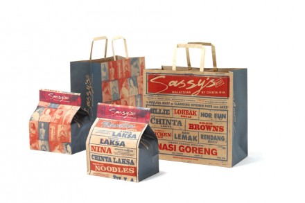
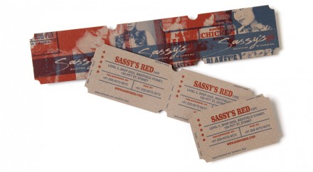
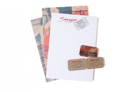
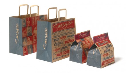
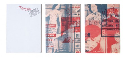
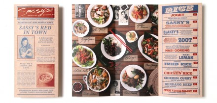
As far as Malaysian food goes, Sassy’s Red from Sydney, Australia is as close as you can get without a passport stamp into the Southeast Asian country. The branding for this place backs up such a boast and is quietly suggestive, which most adults appreciate. The restaurant has a burlesque show vibe, including tickets to a show that double as business cards. The whole presentation is tastefully done and it’s a great example of the branding that can happen when the ties and strings are loosened a little. Sassy’s packaging resembles a marquee, appropriate for a brand that anticipates the top billing, but it’s also another nod to the peep shows from around the world. Tasteful and full of character, kind of like their food, I suppose.
The Forktales Podcast™: Interviews with restaurant industry leaders and visionaries
Restaurant and advertising industry headlines and thinking
Reviews of restaurant experiences from around the globe
Reviews of our favorite design, business, & restaurant books
Our favorite typography and fonts
Inspiration in your inbox
Get the latest inspiration in your inbox every Monday morning, for FREE!
"*" indicates required fields

