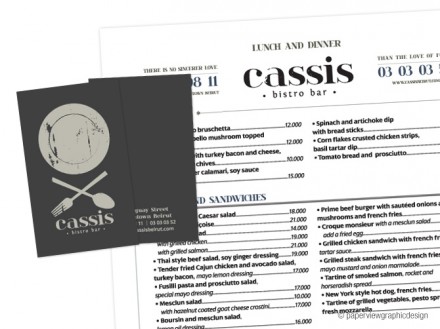
For the second time this week, I’m covering a branding job from the great folks at Paperview graphic design. The mention of Paperview gets me to thinking one off-topic thing. I’ll make this quick: when considering what to name your endeavor, of course you check the availability on the internet and look for existing conflicts that may come up for potential customers poking around looking for you. One additional thing to consider is how you show up in Google. Paperview (unless I add design to the search) shows up as “pay-per-view”. It’s a minor thing for a design/branding company, but for a restaurant, it could mean a pending death. Just a thought. Back to Cassis, a Lebanon bistro bar. This is a great example of the top 10 trends covered on the blog last week. The Cassis logo features a faded image of a plate and below it is the crossed fork and spoon. Just like the trend blog post mentions, the use of crosses in branding has been around for a while and the elements that make up the cross have expanded into such items as utensils. This instance shows the built-in heritage created by such a seemingly simple move. Paperview and Cassis nail the crossed branding and the sophistication and implied legacy is there and that, folks, is just what branding should do. Once inside Cassis, the interiors help relax some of the airs of the branding and it all comes together to demonstrate why a full global perspective is needed when branding. Good work isn’t just creating a slick brandmark; it’s combining all the elements together to create a complete brand vibe that lasts.


